


Tuesday
Jan212014
0704: An Option for Edmonton
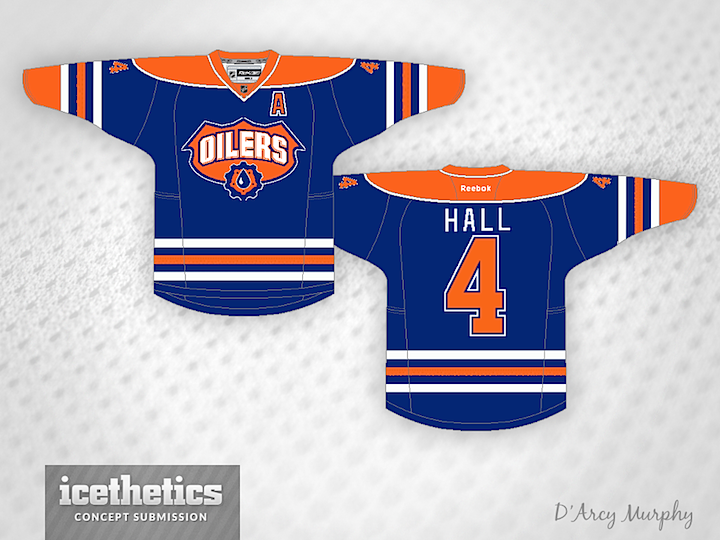
D'Arcy Murphy pointed out that the Oilers are one of the teams that isn't frequently featured here on the Concepts page. He surmised that designers are content with the team's look and see no reason to change it. But he did have an idea for a third jersey. I love that logo from the team's old alternate, but I'd prefer to see some alternate striping too.
Designed by  D'Arcy Murphy
D'Arcy Murphy 
Reader Comments (3)
Nothing against the logo, but it looks out of place on the jersey. If you are going to have a 3rd jersey, then don't just put a new logo on the current jersey - mix it up a little. But not too much, as we have seen with Buffalo's 3rds.
The connected collar is an improvement but the logo just doesn't fit. Love to see Oilers concepts, keep em coming!!
I would invert the orange and white on the shield logo. The gear-drop thing looks right though. Also I would change the striping in some way.