Monday
Jan272014
0710: What Can Brown Do?
 Monday · Jan 27 · 2014 | 8:00 AM PST
  5 Comments

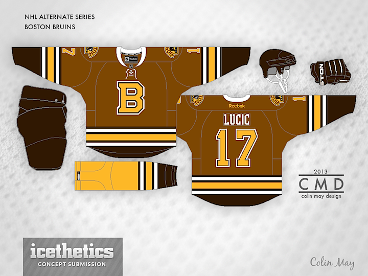
This is the final week of Icethetics as you know it. On Saturday, everything changes. Except the Concepts page, really. New artwork will still be posted daily. But let's make the most of this anyway. Colin May is back with some new stuff. He put together a solid old-timey look for the Boston Bruins. Hey, maybe they should be Washington's opponent for the 2015 Winter Classic.
Designed by  Colin May
 Colin May


Reader Comments (5)
undecided on this for the moment, but i do know one thing and that is that the yellow socks do not match up with this at all.
i think the bruins belong in brown. it would be unique. but not with this design.
The main shade of brown is way too light. The jersey would work better with a darker shade of brown, and a brighter yellow. It's too dull.
Ah, brown...it may not be the best-looking color on ice, but it's a symbol and staple of the Bruins' early, early days. I like this concept, it's a nice idea for a feauxback. The sole "B" is also reminiscent of said days. The shoulder patch, which looks to be basically the current one, looks somewhat like the teams' vintage iconic logo.
All in all, this is a nice concept that combines elements of Boston's first years in the NHL. Very creative, and in the end, not bad at all to look at. The warm mix of colors is easy on the eyes.
What about a yellow sweater with some brown accents? I like the B for the main crest. Nice modern take on a classic look.