


Wednesday
Jan222014
0705: Avalanche Trio
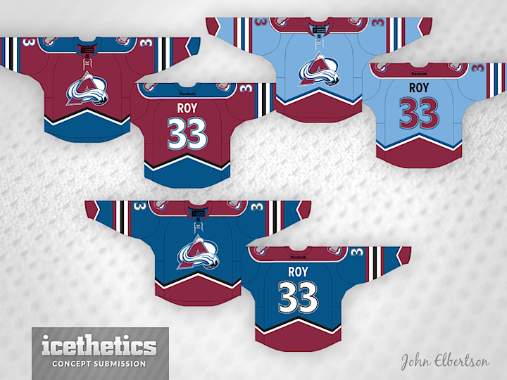
The prolific John Elbertson recently submitted a Colorado Avalanche concept that caught my eye. He managed to create a complete three-jersey set without relying on white. It's a neat look and it makes me long for a return to that classic striping pattern.
Designed by  John Elbertson
John Elbertson 
Reader Comments (11)
not sure which blue one i like better. the dark blue is the standard. the light blue is creative and eye catching, but i am not sure i like it for the avs. however, it does tie into the same color scheme that the colorado rapids soccer team uses, so that would create kind of a "pittsburgh" matching color scheme for the city, which i always thought was cool.
The light blue one would look equally nice in white as well! Great design work here.
Overall, I like these a lot, and they're an incredible improvement over what they're wearing now. However, I'm not sure how i feel about introducing the "powder blue" to their color scheme. In addition, I think the extra arm stripes, especially on the burgundy jersey, may be a bit much.
It looks way too busy... I've never been a fan of that diagonal trim. I know it's supposed to represent the mountains, but it makes the jersey look like there's way too much going on.
Amazing! Love the powder blue away's! The original waist stripes need to come back badly!
I'd like to see it without the sleeve stripes, just the cuffs, yoke, and waist. Nothing wrong with the stripes, but I just don't think they're necessary!
Overall, brilliant concept!
I think you either go with the mountainy design on the sleeves or you go with the striping. Both make them a bit busy. I also don't really care for the powder blue away jersey. The two shades of blue is already being done by St Louis and Winnipeg, and the Columbus 3rd. Stick with the white to accentuate the rest of the colours in the palette. But I do like the burgundy and the 3rd jersey overall.
The Avs badly need the mountains back. However, I agree with JeffB, get rid of the stripes then. Also, the powder blue is not great. It doesn't work with the Avs. The blue at the bottom is good though! Two of three isn't bad!
My last comment would be to make the shoulder yokes also angled instead of rounded. Or go with something like what is going on with the Calgary thirds.
I like the other 2, but the pale blue doesn't really look right. I think if you simplified it, and gave more of the Nordique feel to it (just pale blue and white, with maybe a hint of the burgundy, or silver in the crest), it might have a nice retro look..
no love for the powder blue?? I personally love it. if that jersey came out tomorrow morning I'd be at the nhl store by lunch!
Add another voice to the pro-powder blue side. That jersey's fantastic, and it really pulls the set together. Interesting to see a set that has no white jersey, too. I really like that concept, and I don't support a team that can pull it off well, so it's nice to see a team that can make it work.
While I do think it's time to refresh the look of the Avalanche (or at least the home sweater), I'm not a fan of this. I like the striping, but I don't like the number/letter font. Interesting idea, though.