


Wednesday
Jan292014
0712: Capitals De-Edged
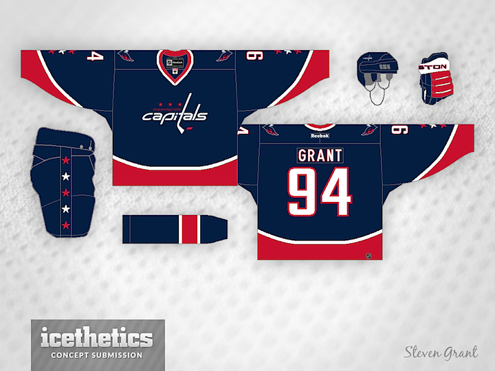
Steven Grant has been redesigning NHL uniforms by taking the Reebok Edge system out of the equation. Today he tackles a blue Capitals jersey with great results. The wordmark doesn't look half bad in white. Of course, personally, I'd still prefer to see an actual logo in its place.
Designed by  Steven Grant
Steven Grant 
Reader Comments (4)
Having the Weagle on this would make it a four or five.
i hate to say it this way, but i have not seen may caps concepts that i have liked. the issue is the over used colors they had a unique color set and went back to the old set that a lot of teams use.
I think this might be more appealing if the blue and red were switched on the jersey and socks. I might even prefer a red helmet too. But keep the blue pants - a good link to the 80's style unis.
Eh...not the best idea for a Caps de-edge in my opinion, but I wouldn't complain having these jerseys instead of their current ones (home and away, the throwbacks are fine).
I'd prefer something that harken back to the blue and gold days, especially with that clever and unique check-striped design they had for 12 years.