


Tuesday
Jan282014
0711: Blue Jackets a Century Back
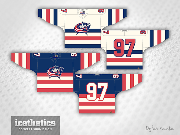
Dylan Wonka is working on a new series that imagines what certain NHL might have looked like if they'd existed back in the 1920s. We'll kick things off with his take on the Blue Jackets — of course I doubt anyone in the early 20th century was designing logos quite like that one.
Designed by  Dylan Wonka
Dylan Wonka 
Reader Comments (3)
Definitely needs an older looking logo. It looks out of place.
What Wonka has explained over at HJC is that the series isn't a "what if" set in the 1920's, but more the current identities plugged into old school jerseys. All of the jerseys he's done so far are pretty neat
Is there a way you could simplify the CBJ logo for this? Maybe make it 2-D? That would put this kit over the top; as of now it looks a little anachronistic with the very modern CBJ logo. Otherwise it's awesome.