Saturday
Jan182014
0701: Fixing the Ducks' Stadium Look
 Saturday · Jan 18 · 2014 | 8:00 AM PST
  17 Comments

One week from today, the Ducks and Kings will take things outside for the first regular season NHL game to take place beneath the SoCal sun. And having just been down there a week ago, I can't imagine how they'll keep the ice icy. Magic, I presume.
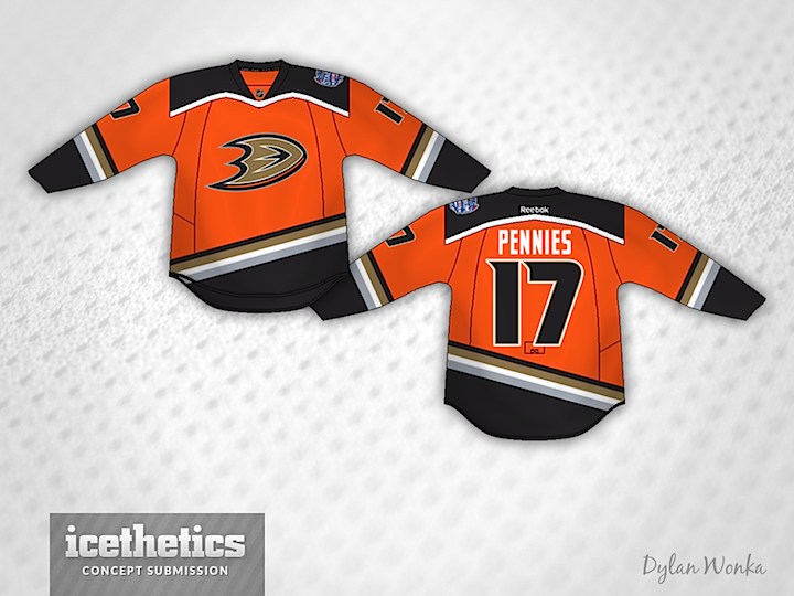
Anyway, Dylan Wonka is back with a fix for the very orange jersey Anaheim will sport for their Stadium Series game. It adds — interestingly enough — a colored shoulder yoke and, hey, stripes! So one question: Better or worse than the real deal?
Designed by  Dylan Wonka
 Dylan Wonka


Reader Comments (17)
Unquestionably better.
wow. just.... wow.
that shoulder yolk is a goofy shape. I guess it's better than the one they're using, but it still just doesn't work. Orange, Black and Copper just isn't a good color scheme.
Miles better. This would make a great full time alternate.
To be fair, almost anything is better than the traffic cone and the chrome toaster that the Ducks/Kings have right now.
I actually love the original Ducks stadium series jersey. It's a modern cut and unbelivably masculine. Looks like a million dollars! I'm am the only one meaning that? Everybody thinks it stinks.
This is not a bad concept, but to unmodern with the yoke and stripes. Tha stadium series jerseys are meant to be modern, and the Ducks one is very modern IMO
In reply to TO RADER, I disagree about their Stadium series jersey being modern. What's so modern about it? Maybe the logo by itself is modern, but it doesn't make the jersey modern. They cut off slanted stripes, which just looks idiotic, not modern. No hem striping or yoke design. So basically I believe that their jersey is just a chrome logo and a plain and boring idiotic design. I think the yoke design brings in the 'D' foot logo they have and it's unique to itself, which in my opinion would be a more modern design than no yoke.
I think the letters should be black. They would stand out more.
Not a fan of the yoke, it reminds me of one of those paper bibs TV people wear to keep their costume clean when they are getting make-up put on.
Infinitely better. The fact there is an outdoor game in Southern California is completely laughable. They might as well just put roller blades on.
That silver stripe throwback to the Mighty Ducks is a neat feature but I don't think it works here. Regardless, this is significantly better than what they'll be wearing next week.
I like this concept much better than what they are actually wearing. For the Stadium Series, this would be really good. The only thing I would do is slightly change the shoulder yoke. I think it would look better with a square yoke. Besides that, this is really good.
Absolutely great! This, IMO, perfectly combines elements from the Ducks past and current colour scheme to make a jersey that I would love to see on the ice. While not my favourite colour scheme, this concept manages to combine the colours in a way that makes it actually pleasing to the eye. Great work Dylan.
While a lot better than the actual stadium series jersey, I still don't love this one. If you dropped the silver stripe and made the stripes across the torso horizontal rather than diagonal, then I would say it is a lot better.
Dylan, I initially didn't care for how the shoulder yoke was done, but then I read your explanation and can see where you were going. It does make some sense, and for a special event jersey it will make for an interesting look. Not sure I'd want to see it every game though.
I love his use of gradient, makes it pop, one of the reasons he is one of the best designers on the site
Definitely better than the all orange jersey. I felt that jersey was the prime example for the fact the stadium jerseys were rushed.
love to see the Ducks go with the original District 5 Unis with red gloves.......... quack, quack, quack Mr Duxworth