


Friday
Jan242014
0707: New Third Jersey
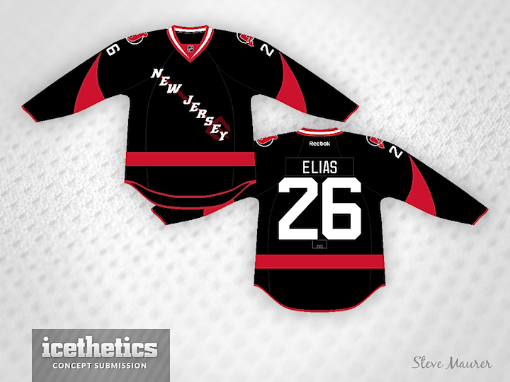
It might be a stretch to post this one by Steve Maurer a Freak Out Friday, but I think I'm bothered by the use of Rangers' style text on a Devils jersey. But I do like the horns on the sleeves. Either way, it's a bit freaky. Is it just me?
Designed by  Steve Maurer
Steve Maurer 
Reader Comments (5)
I like the three-pronged spear, but I agree the diagonal font should only be used on the Rangers
me likey, but question: would the spear be embroidered onto the jersey with the wordmark or would it be subliminated with the wordmark on top of it?
embroidered= A+
subliminated= B+
It isn't so much that I think the diagonal wordmark should only be used by the Rangers, it is more that I don't think one of the Rangers closest geographic rivals should be adopting it.
I do see the devil horns on the sleeves as an interesting element, and the torso reminds me of the 1992 Senators jersey (with the single red stripe). But overall this is kind of freaky.
Huh...strangely, I see this idea working well for an Ottawa concept.
A modern identity like the Devils'? Not so much.
Thank you guys for your comments. I wanted it to look like a fan jersey with the Devils' horns.
Good point about the diagonal wordmark, would the jersey would have looked better with the Devils' main logo.?