Thursday
Jan232014
0706: Music City Revisions
 Thursday · Jan 23 · 2014 | 8:00 AM PST
  8 Comments

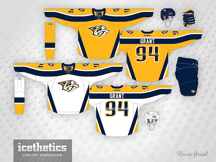
I don't love some of the details of the Nashville Predators' uniforms and I'm probably not alone. The apron strings criss-crossing horizontal stripes and all. So how about some striping revisions? I think Steven Grant has done a great job bringing back a little bit of the team's original jerseys.
Designed by  Steven Grant
 Steven Grant


Reader Comments (8)
i kind of dig the wavy lines on the top. not sure the straight lines on the side match up with it though. having said that, i wouldn't want to see something wavy on the side or have it be completely blank, so i am not sure what the best course of action would be. initial reaction is that i like it, though.
St. Louis isn't the Music City anymore?
@Marm: It's a nickname more commonly associated with Nashville. But can't there be more than one? Also funny that you're commenting on a headline on the Concepts page.
LOVE IT! AMAZING WORK!
I would like to see a blue version of this. I just haven't been sold on Nashville's yellow jerseys.
Although I think this looks better than their regular jerseys, I'm still not a huge fan of their primary yellow jerseys in the first place.
Jonathan, I don't think he was going for a 'wavy' line. That's what reebok does for their sleeve designs. I don't know if with that shape when a person is wearing it becomes straight, but he probably didn't mean for the sleeve design to be wavy.
Id like to see a navy or different version of blue for the home and yellow as a road jersey. The Kings did the Purple/Yellow thing back in the day...