NHL Tournament of Logos

Entries in blackhawks (56)

Friday
Jan182008

Just To Freak You Out XXIV

Can you believe yet another Friday is already upon us? I've had a long day (which began with me waking up at 1 AM) so forgive me if I make this a quick one. Just trying to freak you out a little.

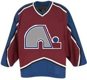
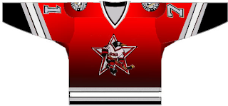
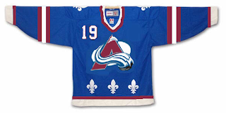
Last week's theme was crazy logos. This week's theme is crazy jerseys. For instance, what if when the Quebec Nordiques moved to Denver, they opted not to change their name or logo — just their colors?

Yep, that would've happened. Good guess.

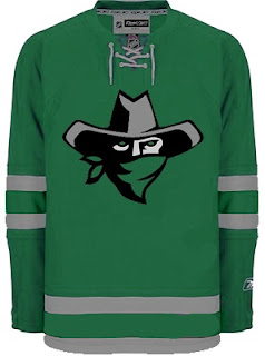
I think this next one was submitted as a Dallas Stars concept, but I don't really get it.

Are all Texans also banditos? On second thought, don't answer that.

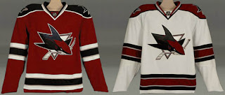
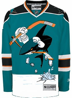
This next one is a little disturbing.

Blood in the water.

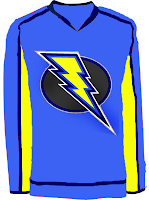
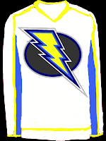
I posted a concept Lightning logo a couple weeks ago. Here are the jerseys that go with it.

I'm still not a fan.

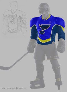
Giant hockey player... smash!

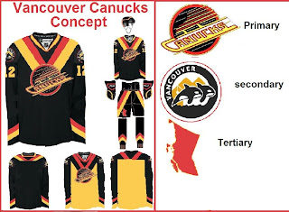
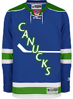
And what sort of person would I be if I didn't work in some Vancouver Canucks art? (Yes, arguably the most well-represented club on this blog much to the dismay of a handful of you.)

The weird thing is I sort of like the whales. Here's what I really don't like.

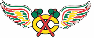
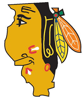
And finally, I've got this logo that serves as a great followup to last week's insane logo fusions.

There's why the Chicago Blackhawks and Detroit Red Wings will never merge. The logo just wouldn't work as you can plainly see.

So it turns out this post was a little longer than I planned. I impress myself. By the way, at some point this weekend I hope to update the Concepts Gallery as I have over 100 images waiting to be added. I'll let you know when I get it done.

Hope you enjoyed the 24th Freak Out post. See you again right here next week!

Friday
Dec282007

Just To Freak You Out XXI

The Freak Out series hits 21 this week — old enough to get hammered. And boy, I think some of the designers this week had to have been hammered. I mean, just look at this.

It might take a moment or two to notice that this is an "If They Mated" example. It's the new Sharks secondary logo merged with the Mighty Ducks third jersey of the mid-90s. But I love it!
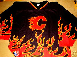
This Flames jersey is on fire! Someone on eBay is really selling it. For real.

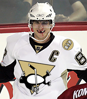
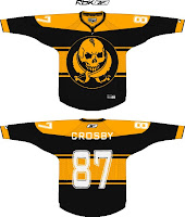
Sidney Crosby recently dropped the gloves in a rare on-ice event. This picture isn't real but it cracks me up nonetheless. There's just so much about it that's so wrong. I'm curious to see if the guys over at Pensblog have anything to say about this.

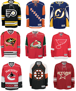
And finally, we have a plethora of "matings" here to share.

To sum things up, what you see above is the Flyers and Bruins, Rangers and Islanders, Devils and Sabres, Blue Jackets and Blackhawks, Avalanche and Wild, Blues and Red Wings, Canucks and Hurricanes (weird!), Bruins and Flyers (opposite of the first one) and Stars and Coyotes.

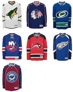
But wait, there's more.

This one is interesting because it's all opposites of the previous image. They are the Coyotes and Stars, Blackhawks and Blue Jackets, Hurricanes and Canucks, Islanders and Rangers, Sabres and Devils, Red Wings and Blues (what the—?), and Wild and Avalanche.

Hope you enjoyed being freaked out. Have a fantastic weekend!

Tuesday
Dec182007

Poll: Blackhawks vs Capitals


vs
Chicago
BLACKHAWKS
Washington
CAPITALS


Place your vote and then feel free to leave a comment as to how you came to your decision. Tell all your friends to drop in and vote! The more voices heard, the more accurate the results!

Poll opening date
Tue Dec 18
Poll closing date
Sat Dec 22

07SCTRN | #2B | CHIvWSH

Sunday
Dec092007

Poll: Blackhawks vs Lightning


vs
Chicago
BLACKHAWKS
Tampa Bay
LIGHTNING


Place your vote and then feel free to leave a comment as to how you came to your decision. Tell all your friends to drop in and vote! The more voices heard, the more accurate the results!

Poll opening date
Sun Dec 9
Poll closing date
Thu Dec 13

07SCTRN | #1B | CHIvTBL

Sunday
Dec022007

Just To Freak You Out XVII

Welcome to the belated 17th installment of the Freak Out series. Time's been getting away from me the last few days so I apologize for the delay. Anyway, this week's art has a very specific theme. I asked for you guys to send me stuff of the "If They Mated" variety and some of you actually responded.

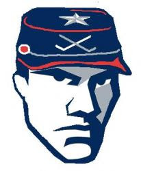
We'll start with a couple of logos I thought were "special."

If you're staring at that and just can't place it, look no further than the Ottawa Senators. You'll recognize his cap from the Columbus Blue Jackets' shoulder patch. That one just cracks me up every time I look at it. It's like the guy took the day off to go to a baseball game but he still can't seem to wipe that constipated look off his face.

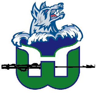
The next one goes out to all my Connecticut readers.

It's a combination of the Hartford Whalers and Hartford Wolf Pack. And the more astute among you might notice the nod to the New England Whalers. That's three leagues covered in one logo. Impressive.

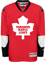
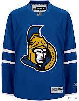
So going back to Ontario now, try to imagine what would happen if the Leafs and Sens (perish the very thought) were to swap uniforms and colors?

Don't send me hate mail. I'm illiterate anyway.

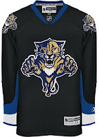
And now for a rivalry absolutely no one could care less about.

Personally, I'm disgusted by this but it does make me laugh a little. What's with the black tongue on the panther? Someone should tell him to stop chewing on his pen.

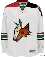
This here is more of a fusion of past Coyotes jerseys. We've got the old colors on the new uniform. How many of you like me would prefer to gouge out your own eyes before watching a team wear a jersey with two different color shoulder yokes? That's got to be breaking some sort of law.

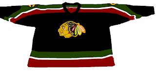
Speaking of law-breaking, remember the scary Blackhawks logo I used to kick off last week's Freak Out post?

Somebody glued it on a jersey. D'oh!

And then I thought this was mildly amusing if nothing else.

But this is what happens when you guys stop sending in the really good stuff. Hope you enjoyed another week's worth of Freak Out art. Hopefully I'll be back with more on Friday. Enjoy what's left of your weekend!

Monday
Nov262007

Help Wanted: Blackhawks Logo

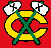
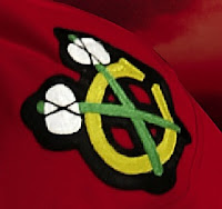
Hi everyone. I've hit a wall and I could really use your help finding a decent quality version of a surprisingly hard-to-find logo. The Chicago Blackhawks wear on their shoulders a logo that depicts two tomahawks crossed over a letter "C."

Actually, it looks a little something like this.

The actual logo is close to this but not quite the same. If you're as anal as I am and look really closely, you'll notice the differences I'm talking about.

Notice the serif on the "C" as well as ties on the tomahawk heads and the overall proportions of the two logos. I know the differences are so incredibly minor that it almost doesn't matter. But quality and accuracy matter to me so just indulge me a little if you will.

Stare at those two logos a while and see if you can help. My goal is to have the proper logo for the secondary logo tournament which I'm anticipating will be the next in the series here at NHLToL. Thanks in advance for all your help!

Friday
Nov232007

Just To Freak You Out XVI

It's another Freak Out Friday here at NHLToL and boy have I got some weird crap today. I have to start out first with something that might cause you to fall out of your chair laughing.

The funny part is I think that's what Homer Simpson would look like if here were an Indian. Anyone agree with that?

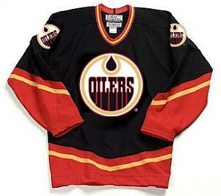
The next image is sure to stir the pot a little bit. It's like one of Conan's "If They Mated." Albertans might not be able to take this. Imagine if the Oilers and Flames got together.

We should make a habit out of that. Pretty funny stuff.

This cracks me up. Twice in the same week, two separate people emailed me concept logos for the Montreal Canadiens — replacing the "H" with an "M."

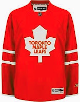
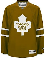
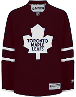
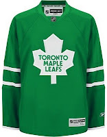
The graphic on the right incorporates the old Montreal Maroons logo so that's kind of cool. But regardless, it's still just weird seeing that. Let's keep it in southern Canada for a moment. A few different readers felt like giving new colors to the Toronto Maple Leafs' uniform. Everything but blue.


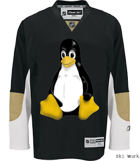
We'll finish off this week's Freak Out Friday on a fairly obvious route.

Yes, that's the Linux penguin. Can't believe I didn't get that one sooner.

Hope those served up a good laugh, or at the very least made you smile on the inside. And don't forget to send in your Freak Out art for next Friday's post. Enjoy your weekend!

Friday
Nov162007

Just To Freak You Out XV

We were a little thin in terms of new Freak Out art this week, so forgive me if today's post is a little light. Still, nothing pleases me more than trying to freak you guys out with some crazy concept art.

As many of you know, the NHL unveiled the 2008 All-Star Game sweaters this week. Reader reaction here was not great. In fact, I got some very Freak Out-worthy concepts based off of those jerseys.

John sent those in along with a few others. You'll be able to find them in the Concepts Gallery this weekend.

We'll keep things moving with the Pittsburgh Penguins next. Each concept here imagines a drastic change. For instance, the first example suggests renaming the team the Pirates — a club that once existed in Pittsburgh during the early years of the NHL.

And the second suggests that the team keep the name but move to Russia.

That silly penguin even looks Russian.

And then, this goes out to all the folks from Quebec. It just doesn't look right. At all.

We'll keep things in the Western Conference now. With all the vanity in the world these days, you had to see this coming.

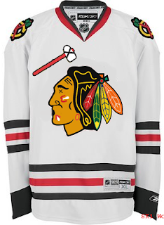
It seems even the Chicago Blackhawks' Indian head wanted a facelift. Either that or he got the Botox. And don't think I'm ignoring the Bears reference in there.

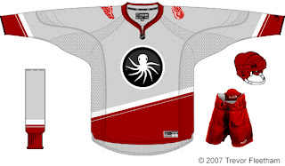
Next we'll head to Detroit where I'm quite concerned.

I think the grey jersey is an interesting choice, but I don't think an octopus will ever be anything but scary on a Red Wings concept. That tradition should stay off the sweater. Having said that, as a logo itself, it's not bad. But I'm still very, very concerned.

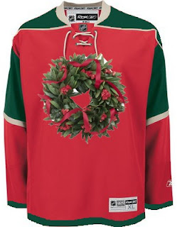
And finally, with Christmas just 39 days away, I thought I'd start my decorating now.

Ho ho ho!

If you've made or run across any concepts you think might be worth posting for Freak Out Friday, don't be shy. Send them along! You can email me at nhllogos@gmail.com.

Monday
Oct152007

Rethinking The 'Hawks

I seemed to have inadvertantly caused quite a stir with my forward-thinking approach to NHL jerseys. Specifically, the fact that I'm not in love with the New York Rangers' jerseys. But that's all right, people will never agree on everything. That's what keeps things interesting.

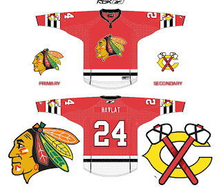
Just the other day a reader emailed me this idea he had to make over the Chicago Blackhawks' sweater. Prepare to be offended, ultra-traditionalists.

Don't shoot the messenger. Please.

It's not that I think this is better than the current red one, because I don't. But what about a third jersey for the future? You know, just something extra.

No? I didn't think so. Worth a shot, though.

Saturday
Oct132007

Result: Blackhawks vs Nordiques

Quebec
NORDIQUES

75% 2,125 votes

Chicago
BLACKHAWKS

25% 693 votes

2,818 total votes

Quebec Nordiques
Advancing to face Buffalo Sabres

Chicago Blackhawks
Eliminated


Poll opening date
Mon Oct 8 @ 4:23 AM
Poll closing date
Fri Oct 12 @ 11:59 PM

07VNTRN | #1C | QUEvCHI37