Icethetics

via Blogger

Entries in jerseys (100)

Sunday
Jul202008

Want To See Philly's New Third?

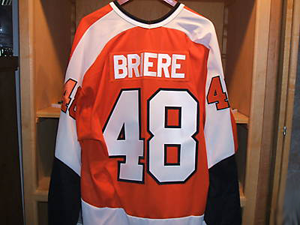
An interesting photo turned up in my inbox this afternoon. It shows Daniel Briere's new third jersey hanging up in the locker room.

The Flyers haven't made anything official yet, but rumors have been floating around since March.

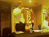
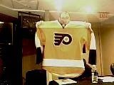
For what it's worth, my opinion on this photo is that it's legitimate or a Photoshop job too well done to be an amateur — though folks here do love their Photoshop. But seriously, I think it's an actual photo of a jersey. It doesn't differ much from the cell phone photos that surfaced several months ago. Here's another look at them.

The main difference appears to be the nameplate. On the March leak, it appears the orange jersey has a white nameplate with orange lettering. Here, it's switched to a matching nameplate.

Other than that, they look the same to me. So it appears we've gotten our first real look at what the Flyers will wear as an alternate jersey this season. Hope you guys like it.

UPDATE (7/21 2:25 AM): So it's definitely a photo of a jersey, it's just a vintage replica being sold on ebay. Kudos to Hockey Week for the find. I think we should probably expect to see something more like what's in the two cell phone pictures. As always, I'll try my best to keep you updated.

Saturday
Jul192008

Bruins Confirm Alternates

It seems like over this past week the news leaking about next season's third jerseys just will not stop. And I don't see anyone here complaining about that. As far as news tonight, we've got newspaper journalists confirming alternates for the Bruins and Hurricanes.

Fluto Shinzawa of The Boston Globe wrote in the Bruins Blog last week that the Bruins will in fact have a third jersey for the new season — something we've all kind of known for quite some time now. Shinzawa also wrote, "The final design has not been released, but it will most likely feature the retro bear, on the shoulders of the current uniforms, on the chest."
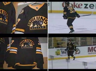
Below you can see a sample of the new sweater in action. During a game last season, NESN broadcast video of a player skating around in it — it's not actually Patrice Bergeron.

The full video was originally posted on YouTube but has since been removed — whether by the person who uploaded it or by YouTube, I don't know.

And this is just a followup to yesterday's post. News & Observer writer Luke DeCock said in his blog there was "a good chance" the Hurricanes would have a new alternate sweater this season. A similar story was published in today's paper. You can read an excerpt from the article below.

The Hurricanes will unveil a third, alternate jersey this season and hope to have it ready to reveal at the Caniac Carnival on Sept. 21, Hurricanes general manager Jim Rutherford said.

Rutherford declined to comment on the design, but team officials have talked for years about a black jersey with the team's secondary, waving-flag logo on the chest.

The team planned to unveil the new design last season, but the debut was pushed back a year because of the introduction of the NHL's new "uniform system" from Reebok.

The Hurricanes are one of three NHL teams not to use a third jersey at some point, with the Red Wings and New Jersey Devils the others.


If you want to send in tips regarding this season's new crop of third jerseys, email me at nhllogos@gmail.com.

Saturday
Jul192008

Leafs Confirm Third?

This is a followup to a story I posted on Wednesday about a jersey that turned up on the Maple Leafs' official web site recently.

According to a reader who emailed me, that is going to be the Leafs' new third jersey this season. The following is the email sequence that was forwarded to me:

Whats the deal with this? thats not the Leafs jersey! Is it being altered to fix what was broken last year? Please tell me it's true!!!


Thank you for your email,
The jersey in the link you have provided is the new Maple Leafs third jersey.
Thanks for being a fan!

Names have been removed for privacy reasons. I have no other corroboration this information so take it for what it is — I'm sounding like a broken record, I know. But I don't want to pass stuff off as factual before I know it to be so.

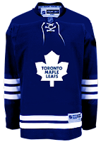
The thing is, the majority of rumors swirling suggest a vintage white sweater as next season's alternate. That could just be excited fans promulgating wishful thinking... or not. But if the above does turn out to be true, we saw the Toronto Maple Leafs' third jersey 11 months ago. Here's another look at it.

If anymore support for this surfaces, I'll let you guys know.

Thursday
Jul172008

Ducks Logo Enlarged?

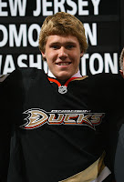
Apparently the Ducks' uniforms will be slightly altered for the 2008-09 season. Don't get too excited though, it's nothing huge. It's just bigger — by that I mean the logo (er, wordmark?) on the front of the sweaters. Based on the looks of things at the draft, this is the case.

Examine these two photos as evidence. On the left is Todd Bertuzzi in game action last season. On the right is first round draft pick Jake Gardiner.

Compare the size of the logos on the two sweaters. It does appear that the logo stretches farther across the sweater on Gardiner's jersey.

But this could all be in our imaginations. Thanks to Jason for pointing out this possibility.

Wednesday
Jul162008

Rumors & Possible Leaks

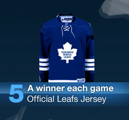
Leafs fans, just when you thought all was quiet on the jersey front after this morning's announcement, something strange has happened. In the Game Master section of the team's official site is the following graphic.

That's confusing. For sure it's not what the Toronto Maple Leafs' jersey looked like last season. It had different striping and no laced collar. Thing is, it looks and awful lot like one of those concepts I posted back in the early days of NHLToL. In fact, see for yourself! It's a dead ringer!

In fact, that jersey I posted last August was one fan's recoloring of a Rbk EDGE Bruins jersey. How did that exact image make it on the Leafs' official site?! That's my question. Weird. Are the Leafs considering a jersey alteration already?

I'll keep you posted on whatever I find out. Thanks to Tyler for pointing this out to me.

And as we near the new season, I'm getting more and more emails from people who say they've seen or spoken with someone who's seen new alternate sweater designs. I can't speak to the veracity of the claims, but I'm happy to post them nevertheless. So here's what's been going around recently:

Bruins
black with primary and secondary logos swapped like previous rumors
Oilers
royal blue and orange vintage style
Senators
black with SENS written across the chest
Sharks
black, no further details
Blues
similar in style to Minnesota's home sweaters
Maple Leafs
white vintage style with laced collar, like 2006-07 alternates

One source is reporting that 17 teams will have alternates for 2008-09. Previous rumors said 18.

And finally, the Canadiens will apparently have three different jerseys throughout the season to commemorate their centennial. I'm assuming this means three in addition to the regular home/road uniforms.

That's it for now. Should I hear anything else, you'll be able to read it here. By the way, I plan on migrating the big rumors post from NHLToL to Icethetics soon just so you don't have to leave this blog to see it. I'll wait for a slow news day so it doesn't bump everything that I've posted recently.

Tuesday
Jul152008

Alternates From A Fan

In combing through my inbox I came across a set of third jersey designs one reader sent in recently. There's 18 in all but I'm going to start with six — my favorites of the bunch.

An obvious win for a Hurricanes alternate sweater would be this one.

Though it steals a page out of L.A.'s book with the locator on the front of the sweater, it's not a bad look. Speaking of the Kings...

...how about a purple jersey with the Gretzky-era logo? One of my favorite logos has to be the new alternate unveiled by the Canucks last summer. I'm dying to see it on a uniform.

As far as that jersey goes though, sort of reminds me of the Whalers. But I do like the green. A lot!

Of the few things we have confirmation of regarding next year's third jerseys, is that the Blues will use a new logo that incorporates the Gateway Arch. Here's another concept with that in mind.

It may not be a new logo but it does include the arch.

I know many of you are opposed to black third jerseys, but I think they work for teams that actually have color in their regular home sweaters — the Sharks and Coyotes, for example.

I love that shield logo too. And here's a unique take on Phoenix's logo.

I'll have more from this artist in the future. In the meantime, stick around. I'll be posting information about the brand new International Hockey Association logo project a little later this evening.

Monday
Jul142008

Four New Sweater Designs

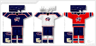
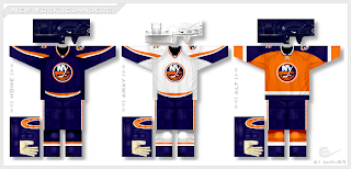
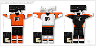
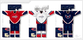
Icethetics reader Paul (aka capn89) has been redesigning NHL uniforms league wide and he's sent in another batch for your enjoyment. Most recently you saw him take a stab at the Senators. Today we've got four new teams — beginning with Columbus.

I'm not sure how well a red third jersey works in theory for a team named the Blue Jackets, but looking at it, you can't help but like it.

His Islanders jerseys are sharp!

He's used a Liberty Bell logo on the shoulders of the Flyers jerseys.

Notice how the home sweater is orange. I think most Philly fans tend to prefer that to black. And finally, we have the Capitals.

That secondary logo just looks killer on the front of the third jersey. Let's hope the team's smart enough to actually make one for this season.

By the way, tomorrow I'll have more details on the new logo design contest I'm launching. Imagine a league with 30 teams — each team has a name and color scheme — but none of them have logos! Designers, this one's for you. You'll be able to brand a team from the ground up!

Monday
Jul142008

“Official” Oilers Concept Jerseys?

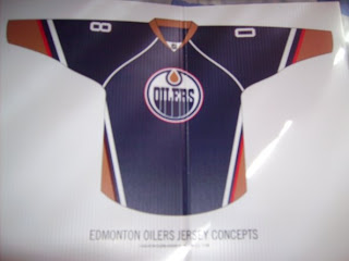
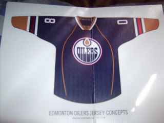
Apparently some Oilers jersey designs have been floating around recently. I guess the claim is that they're official concepts being considered by the team as a potential alternate or home sweater replacement. Have a look at see what you think.

Like I said I can't vouch for the veracity of these images. Just take them for what they are.

I like them both but the first one would be my favorite. Express your thoughts in the comments below.

Thanks to Zac for the tip.

Sunday
Jul132008

Pens, Leafs Fan Art

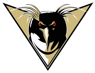
One new artist I've been receiving concept designs from signs his work Ivall. His first submission was a Blackhawks logo that was met with a lot of praise. His followup was a Sabres logo that landed in a Freak Out Friday post.

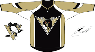
In the last few days he's been hard at work on new logos for the Penguins and Maple Leafs. We'll start in Pittsburgh.

You know, of all the Pens artwork I've been sent, I think this is the first time I've seen a forward-facing penguin. Despite its intricacies, it's a pretty well-drawn logo. Check it out on a jersey.

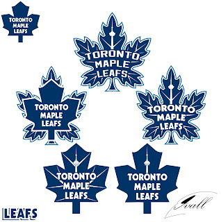
He also made five attempts at a new Leafs logo.

It's hard to say which is my favorite but I think I'd have to go with either the one on top or middle-right. Thoughts?

By the way, we've got new sweater designs from Paul (aka capn89). He's made Philly, Columbus, Washington and one other team — got to leave something to the imagination. Check back tomorrow for that!

Sunday
Jul132008

Coyotes Logo Evolution

I've been going though my computer to clear off a bunch of old files when I came across an interesting video clip. It was posted on the Phoenix Coyotes web site a few years ago when they unveiled their new (current) logo. As a person who comes from the video/animation world, I was fascinated by it and I thought I'd share it on this Sunday morning.

Now, just to be clear this video is property of the Coyotes hockey club and I have nothing to do with it. I'm just a fan and I wanted to share it with you guys. Someone obviously put a lot of effort into it.

But what sort of person would I be if I didn't also have concept art for you?

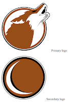
These two logo sets come from the same designer and I think they're equally cool.

This one I felt was confused. You're either using the moon as a C or not — you can't have it both ways without it being weird.

And to finish... this is something I don't really like to do, but I'm making an exception. Occasionally when I post a concept logo, I'll get emails from people with adjustments to that design. And I tend to not post them because I feel like it takes away from the original artist's work. Here, I believe it helps it.

Back on NHLToL, I posted this Coyotes logo set by designer Sigma Kappa. But one reader made some tweaks to the second logo.

I like this one just as much as the original. Both have their pros and cons but I figured I'd post it so you guys could decide which you thought was better.