Tuesday
Oct302012
0255: Oil Kings Simplified
 Tuesday · Oct 30 · 2012 | 9:00 AM PDT
  6 Comments

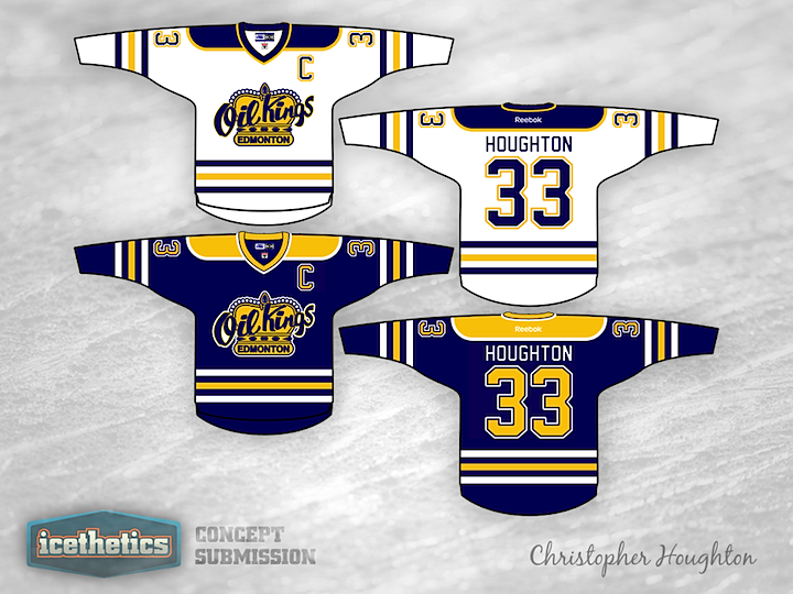
Minor League Week picks up with the WHL today. Christopher Houghton offers a simplified color scheme and uniform design for the Edmonton Oil Kings. What do you think of them without the red?
Designed by  Christopher Houghton
 Christopher Houghton


Reader Comments (6)
yet another copy of Oilers/Sabres jersey, looks good but not original design at all. not impressed by the author's imagination (or lack thereof). Just because the team is in the same city doesnt mean it has to have the same jersey design as the NHL team.
It's just the Oilers jersey with yellow instead of orange basically
It's good, but the Oil Kings have such standout jerseys now that it's tough for me to evaluate it on its own terms. I'd love to see another team in the league with something similar.
This feels like the person was really baked and did this in 5 min and thought it was the greatest ever,.... eeeeeh, creativity is a fail, logo size is a fail.
I've gotta agree with Jamie. It is good, but the Oil Kings is so great! It is a hard bard to get over. Can't say that this is better, bit it is still good.
I thought I would just write to clarify that I designed this, indeed, without any imagination. I just wanted to ask the question; What would the Oil Kings looked like if they came in line with the city's colours and their parent club's uniform scheme. If I genuinely were to choose the uniforms for the Oil Kings I would, most likely, keep them very similar. I would return to the 70's style bottom stripe though to match the arms unlike what they have now and change the blue to navy as I just simply hate red and blue together.