


0229: An Angry Wolf
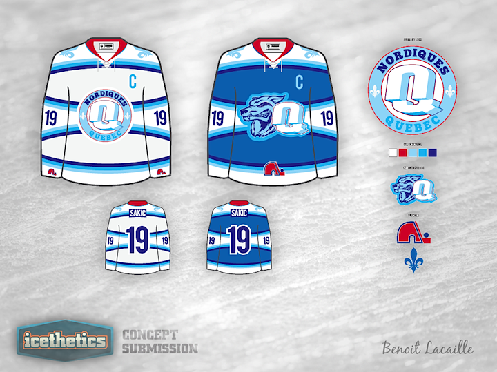
There's been a lot of talk about the NHL heading back to Quebec in the coming years, so naturally Nordiques concepts have been making more frequent appearances in my inbox. Here's a unique one from Benoit Lacaille.
 Chris
Chris
Here's something fun. Want to see how I keep the concepts flowing on a daily basis? Watch me work — in time lapse, of course.
If you're a concept artist, maybe you could give this a try next time you sit down to design something. Might provide some neat insights for readers.
Chris

Benoit read your "reviews" and decided to make some revisions. I'll turn it over to him here:
I was surprised at some of the comments so I decided to explain myself but most of all take some of the constructive comments and make adjustments to the Quebec concept.
Now the wolf is bitting a puck and I put him inside the branding of the team. I kept some red inside the colour scheme because those are the original colours of the Nordiques. Also I put the old logo on the home uniform. It is one of the most celebrated logo in the underground rap culture, a true original and it is a good way to sell more jersey. I put the alternate logo on the right shoulders and kept only one "Fleur de Lys" on the left side. I kept the red collar on the home jersey and decided that red sleeve numbers and a red trim on the number on the back would harmonize the red in the overall jersey design.
Some remarks to the not so friendly commentary:
- I love European jerseys so thanks for the compliments. I understand they was meant as an insult but it is no insult to me.
- It's not four logos but a primary, a secondary and shoulders patches like most teams in the NHL.
- Four colours is also something you see a lot in the NHL these days.
I could, like a lot of people on the concepts page, change the colours on the jersey and put almost the same logo or work, think and create something different. I choose, like most of the good designers on this page, the second option. I love criticism and I can grow from it. I hate bashing just for the sake of bashing.
I'll drink to that.
Benoit Lacaille 
Reader Comments (15)
I applaud the effort of doing some totally different with pretty much everything, but that is truly one of the busiest, ugliest concepts I've ever seen. The logo(s) is(are) attrocious. This belongs in Freak Out Friday.
Four shades of blue, four logos? Seems little excessive for an NHL-style jersey. This could possibly work on ECHL level but not in the NHL or even AHL. Simplify the blues and shoulder yokes and get rid of the old Nordiques logo and you'd be much better off. Not a big fan.
The Q and N logo is clever but the rest of the jersey looks kinda busy and unnecessarily disorganized.
Those are some of the strangest places to put a logo that I have ever seen. On the bottom and end of the sleeves
Brilliant colors and striping! Logos could use a little simplification to make them look professional. I think the several shades of blue work here! Nice nod to the past with the red accents as well!
I would recommend removing the logos from the bottom, finding a clever way to maybe merge the wolf and the "Q" to create a simplified yet clever design (think how Buffalo incorporates a B or Whalers incorporate the W-H).
Overall nice job! I'd say you're 75% there (as a career art director myself).
That NQ mark is genius. Sort of has this modern-retro vibe to it that feels like a very subtle nod to the original Nordiques logo. The wolf head looks pretty good, but that right next to the NQ takes up too much space on the front of the jersey.
Am I the only one who thinks this looks like a KHL jersey? ether way the colouring and logo design on the white jersey is decent
For some reason (I think it's the shape) the mini igloo on the front of the home Jersey seems inappropriate to me.
Wow. I'mshocked at some of the criticisms on this one. I think it's great. Lose the old Nords logo and it's perfect. Very original and very fitting of Quebec City. And the 'Q' 'N'' logo......brilliant!
Agreed with much of what has already been said here. That "Q-N" logo is brilliant. From a photoshoppingly illiterate guy, what if you changed the direction of the 3D (from right to left) in that logo to incorporate the Q-cross as the entrance to the igloo somehow?
I'm surprised that so many people dislike this one strongly. Granted, I'd remove the old Nords logos, and maybe the red collar...possibly the circle around the logo on the white jersey. The Q-N looks great, though; the letters look as if they're sculpted out of snow.
The major design groups brainstorm and critique each others work until the final product is perfected (or in a few cases, not).
Most designers here work on their own.
Therefore, we shouldn't come down too hard on individuals. This really is a great concept - a lot better than some of the winning IceHL jerseys. A few tweaks here and there and it's ready for the rink.
My question is in the striping on the sleeves. Once the stripes reach the midpoint of the numbers, shouldn't they start to curve in the other direction?
This is such a refreshing concept! As said a few times that N-Q logo is great, the wolf not so much and the inlcusion of the classic logo is distracting. Still excellent CONCEPT, definitely not a finished work. With some tweaks this could be an NHL ready jersey.
This looks like a European hockey jersey, all it needs is a couple ads to make it even busier and clumsier
Sorry, gonna have to insist on my previous comments. Still four (4) different shades of blue plus red and white for total of of six (6) colours. Get rid of two of the blues; not necessary. And yes you do have four (4) different logos - primary, secondary, Fleur de Lys, old Nordiques logo. Yes teams might have primary and secondary logos but they use one as a main chest logo and the other as a shoulder patch and vice versa. No need for two (2) additional logos on top of that, especially in strange places such as the bottom of the sleeve or near the hem line or underneath the collar.
I think the nQ logo is one of the best simple concept I've see in a long time... it can be used in a video promo as an ice block exploding from any Carnaval's structure (castle, igloo,...)
Bravo!