Monday
Oct082012
0233: Predators Re-Bourne
 Monday · Oct 8 · 2012 | 9:00 AM PDT
  18 Comments

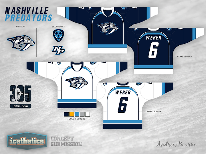
Concept artist Andrew Bourne has taken on the task of making over the NHL. In today's installment, he tackles the Nashville Predators. Hit or miss?

Designed by  Andrew Bourne
 Andrew Bourne


Reader Comments (18)
This one I actually like. It looks really good, and the logo is very sharp.
I like the simplicity of the striping, but the colors don't work at all. the league has enough blue jerseys. I think with a better color pallet this could be a good set but it falls short as it is now.
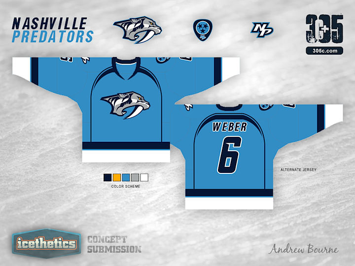
There we go! So happy to see lots of colour injected into a Bourne concept! All three of those are actually great jerseys. I am really not a fan of the baby blue, but I really think it works here. Great work, Andrew.
I really like this and I'm okay with even more blue just because it lines the Preds color scheme up with their minor league club the Milwaukee Admirals.
Nashville has one of the most unique jerseys in the league. Coupled with the fact that there are too many teams sporting blue already, this recreation of the Preds gets a miss in my book.
No more blue. There is obvious talent at work here but concepts should be creative works that differ from what every team is currently wearing. If there's one thing that's been overdone in the last few years it's two tone blue jerseys. Do anything else besides blue, except also maybe cream.
Predators jerseys need yellow somewhere.
I really like the jerseys...not a big fan of the greyed-out Pred Head. I know that the fans in Nashville LOVE the gold (as a season ticket holder in 2011-12, I know it first-hand), so I don't think this would be a great idea for them. Pens fans will likely hate me for saying this (I think), but I'd really love to see the skating Penguins logo on the home/road set (no circle logo). Match that with a gold/black alternate, and I think that's the perfect set for the Pens...but, again, I have a feeling that most Pittsburgh fans will completely disagree with me on that.
Oh wow, light blue, navy and white. This will TOTALLY stand out!
Definite...HIT. This is almost too awesome, loving the different blues he incorporated in this (and I personally was always a fan of different blues in the same jersey I.e. the old penguins). I just would like to see a tiny bit of yellow. Maybe somewhere on the arms or neck. I don't know...that's just me. Maybe because it would be hard to vision the Preadators without yellow all together but otherwise incredible job. 6/5 stars
These are pretty good, but I really like Nashville's unique Yellow jerseys. the NHL already has enough blue jerseys.
Nashville is a team that chose to go against the grain and not wear a blue jersey like many other teams opt to do. That being said, I don't like how you chose to go double blue for them. Just my opinion!
Blue on blue. Very original idea.
This one actually made me jump with excitement! I love the colour scheme, including the colour tweaks to the logo. Great concept!
Best re-bourne concept yet!
Thanks for all the great feedback!
I know it's 'another blue jersey' but I'm not really looking at individual teams in my series as much as I am looking at my entire series as a whole. As a whole, there aren't many blue jerseys.
Although I LOVE the Preds' current jerseys, I wanted to incorporate their past which was primarily blue, silver and white. Again, I love their yellow jersey but it looks horrible on tv. So, back to blue they go with a hint of that AHL Admirals baby blue. Thanks for noticing, Matt Mcelroy.
Love the blue. I think it needs more yellow just a touch. This reminds me of the Seattle Seahawks logo and jerseys from before with the neon green eye.
Thhese are really nice, however theres just too much blue in the nhl i like how they went with their distinct yellow unis, so if you added some yellow in these or a yellow jersey based around you design it would look sick.