Thursday
Nov012012
0257: Greetings from Nova Scotia
 Thursday · Nov 1 · 2012 | 9:00 AM PDT
  7 Comments

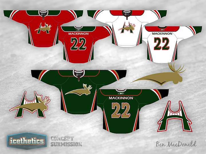
All last week we covered the AHL. Monday the OHL, Tuesday the WHL, yesterday the ECHL, and today, we wrap up another Minor League Week with the QMJHL. Ben MacDonald sent in this Halifax Mooseheads option some time ago. It's a very simplified look for the team from Nova Scotia — even if it is a little Christmas-y. What do you think of it?
Designed by  Ben MacDonald
 Ben MacDonald


Reader Comments (7)
I like it. It features Halifax's landmark bridge, and the more modern take on the moose is of welcome relief compared to the cartoon they currently employ.
Normally, I'm not a fan of just recycling jersey designs from NHL or other teams (in this case, the design of the arms and sides comes from the Ducks), but in this case the structure works well with the new logo.
I'm also not a big fan of the colour scheme, but there's nothing wrong in carrying forward a team's tradiational palette into a new design. And, if I'm not mistaken, I think that bridge is painted green and red too, is it not?
This is definietely ice-ready. Good job.
I think the alternate is unnecessary and doesn't add much to the look for me.
That crest on the home and roads is clever and an improvement over their existing logo in terms of simplicity (as much as we Moosehead drinkers may enjoy the current logo). I like the striping, as I find it quite striking; however, the shoulder yokes don't seem to fit with the striping very well. I'd like to see something more edgy there to tie it all together.
first time poster. i liked this one enough to write something, so that's got to say something. i especially like the green one. great colors. simple design.
as a chicago wolves fan, i hated the manatoba moose, but always thought they had one of the best logos in hockey. i like the reference to thier sweaters with the antler numbers on the back.
The logo is similar to the Buffaslug, but overall the design isn't bad.
that Moosehead logo... reminds me too much of something that i'm sure a hockey team would not want to be associated with. the H logo looks alright, but is a bridge really that significant to Halifax?
As a Mooseheads season ticket holder I do find their jerseys to be Christmas-y, with the exception of their current 3rd (black w/ "Halifax" script).
I do like a couple things, one being that he used the bridges to make the H, and the other is the green jersey. The Q is full of red jerseys, so a green one would make them stand out.
Take out the Anaheim colours on the green jersey above and it could work. Not sold on the font. Didn't like it when they had it 15 years ago either.
I enjoy how the logo invokes H for Halifax involving the bridge, but also M for Mooseheads. The alternate crest reminds me of Phoenix's current thirds, and I think it's a good look. One thing I'd change is for the white jersey to have green shoulder yokes instead of red, as I think the green would blend better. I'd utilize the red more as an accent colour on the white jersey (apologies, I'm unsure of which is home or away in QMJHL). Otherwise fantastic work on the logo design and the concept!