Saturday
Nov032012
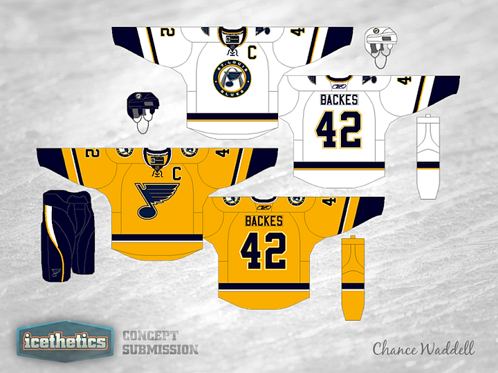
0259: Blues in Gold
 Saturday · Nov 3 · 2012 | 11:38 AM PDT
  5 Comments

Since the NHL officially canceled the 2013 Winter Classic yesterday, I don't think it's appropriate to have a Winter Classic Weekend concept today. So here's a St. Louis Blues jersey set from Chance Waddell. By the way, Chance isn't suggesting a gold home jersey for a team called the Blues. These are road and third jersey options if the Blues were to make their current third their home uniform.
By the way, got a really cool University Sunday concept for tomorrow, complete with a time lapse video of the designer creating it.
Designed by  Chance Waddell
 Chance Waddell


Reader Comments (5)
Not bad, except for the fact that it looks like a Predators rip off and the logos aren't the same.
that white jersey is equally beautiful if not better than the current blue 3rd, I'm definitely in favor of eliminating the two tone blue color scheme they have going right now (although their current jerseys are upper half of the NHL), these jerseys are clean, work exceptionally well and have a great balance of color
The whole "Preadators rip off" thing was completely accidental because I had forgotten that they even had gold jerseys when I made this set 8 months ago. And if you look, their jerseys are actually rip offs of the Blues' home and roads. Teams accidentally copy each other all the time. And of course these have different logos, the gold jersey is the ALTERNATE jersey so I used an ALTERNATE logo. But thank you to MDM and the other 250 people that have given this 4 1/2 stars. I like the Blues' third jersey better than their regular set, and would love to see them promote it to full time status along with a matching white version.
I'm in the minority about the Blues - I love the current home/away (I think the royal/navy blue is a great compliment for a team called the Blues) and only like the alternate. That said, these two jerseys added to the current third would be incredible. I love the gold jersey particularly, and I don't think it resembles the Predators' current home jersey any more than the Florida Panthers' home jersey resembles the New Jersey Devils' home jersey - they may be the same color, but the design is entirely different. If anything, this set makes them look LESS like the Predators since the Preds' set is a layout-copy of St. Louis' current set.
I don't want to suggest the Blues making another unique logo (we all remember the Keenan-busted alternates a few years ago), but I wish that St. Louis had a different logo to use for the shoulders. I love the bluenote, but it's not different enough from the suggested crest (bluenote in circle over the Arch) to make them stand apart. Still, awesome, awesome set.
In the concept, I like the white away jersey more than the gold alternate. Personally though, I love the current home/away jerseys. I really don't want the Blues to make their current 3rd jersey the home jersey. I do like the alternate logo a lot, but the Blues' regular jerseys need to have the large bluenote. It's one of the best logos in the NHL and they need to continue wearing it proudly. If anything, I think the concept white away jersey should be an additional alternate for the road only. Thanks for sharing the concept! GO BLUES!