Wednesday
Dec262012
0312: The Lighthouse
 Wednesday · Dec 26 · 2012 | 7:55 PM PST
  5 Comments

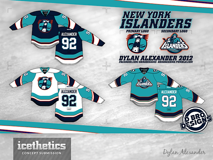
Got another interesting take on the New York Islanders today. Dylan Alexander used the old logos from the mid-90s and swapped the colors around a bit. What do you think?
Update on Sunday · Dec 30 · 2012 | 2:48 AM PST by
 Chris
Chris
 Chris
Chris

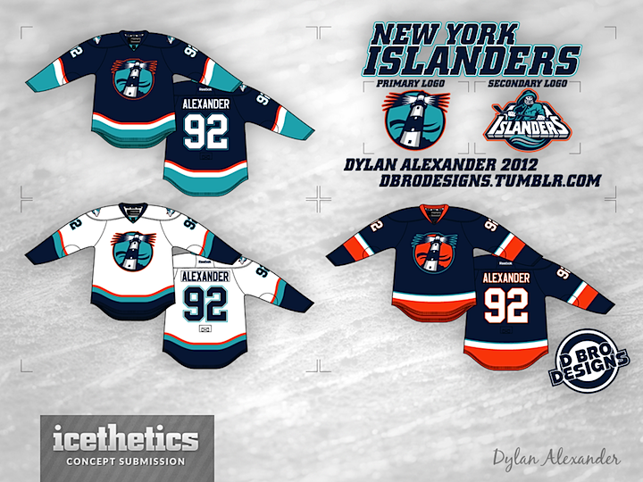
Dylan made some revisions to his Isles concept. Here they are.
Designed by  Dylan Alexander
 Dylan Alexander


Reader Comments (5)
As one of the handful of people that actually liked the original Fisherman jerseys, I would buy this design in a heartbeat.
I am not sure about the logos, because i love the current ones, but the colors and design are amazing.
Those jerseys would be green-lit if it was 1994. Your on the right track with the lighthouse. Not sure about that much teal though.
I would love to see the orange one was a 3rd jersey
I would love to see the primary logo here (the lighthouse) on an orange alternate jersey (alongside the current/classic home and away ones, which should be kept as-is).