Monday
Apr302012
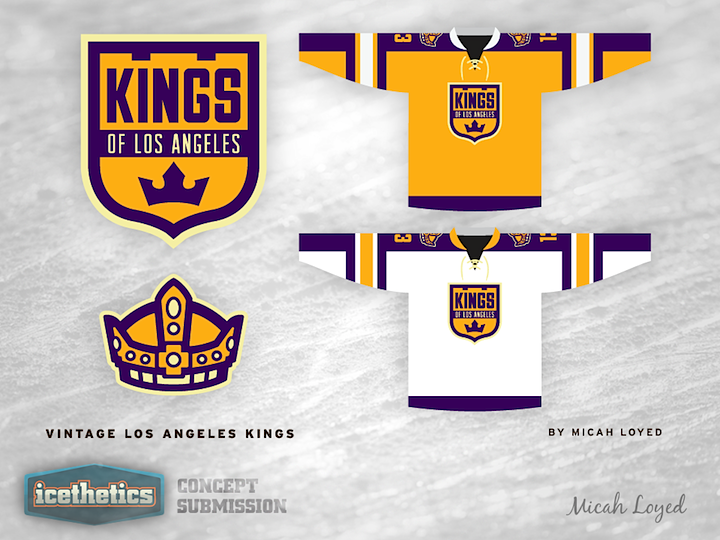
0072: Vintage L.A. Kings
 Monday · Apr 30 · 2012 | 9:00 AM PDT
  10 Comments

Last week I posted a Los Angeles Kings concept which, while I liked it, was widely panned by readers. As Vintage Week carries on, I've got another perhaps to make up for it. Micah Loyed's retro style jersey and logo designs are absolutely stunning in my opinion. If all of the design world starting working toward this type of look and feel, I think we'd all be better off. But then I may be alone in that line of thinking. What about you?
Designed by  Micah Loyed
 Micah Loyed


Reader Comments (10)
This is a strong jersey design but, just like the last two, the rounded and slightly cartoonish logo is the weak point. Though in fairness, the Kings are a tough team to brand, they've never really had anything better than this.
like it, except for the "Kings of Los Angeles"... did we learn nothing from the Mighty Ducks of Anaheim and the Los Angeles Angels of Anaheim? take the "of" out
I think the yellow one would be better with no white on it. I also don't like the sheild like crest, just a crown would be much better. The shape of the crest is the main thing I don't like about the current Kings jerseys. The white jersey is good except the crest again.
Awesome concept..would like to see the crown on the yellow. I think home jerseys shouldn't have the city named on them...
The jersey design is nice and clean, but the home would look better with purple as the primary color. The logos are good, but the simplicity of the shield design doesn't seem to match the crown on the shoulder. Have to agree with Wayne about the "of," get rid of it.
I know most folks are tired of the glut of black jerseys floating around the NHL in recent times, but I feel like most Kings fans (myself included) like the black & silver look, and the Lakers have a solid hold on the purple & gold identity in LA. But I'd be cool with a purple & gold third though
I really like this, it is much better than any other LA design I've seen. It works great by blending the look of the Lakers, into a common city identity through those colors and design. Its very clean and sharp, while not making the team look weak like other designs with these colors may have done. I'm also glad it uses all three colors, as this really balances it out.
Now that is one sexy kings concept. Ima fan!
With the colors and, especially the simple crown, it reminds me a lot of the Sweden jerseys (which are great designs).
Unfortunately the first thing I see in the shield is the corners rounded off the logo for the ultra cheapo roadside motel 'Knights Inn.' I'd also lose the white border around the crest on the yellow jersey and replace the yellow in the crest with white for better contrast from the body of the jersey. There's no need for a double border on that jersey. Maybe in print you'd need that stroke depending on the background, but not here.
Like others have said, Kings of Los Angeles just doesn't work for me. Seems too formal for a city that most people call L.A.
All that being said I really do like the striping on the jersey and placing the crown on the shoulders, but the main crest could use some tweaking.
Johnny, good comments but knights Inn doesn't hav rounded corners.
http://www.traversecity.org/lodging-members/knights-inn/knights-inn-logo