


Wednesday
May232012
0095: Chicago Canucks
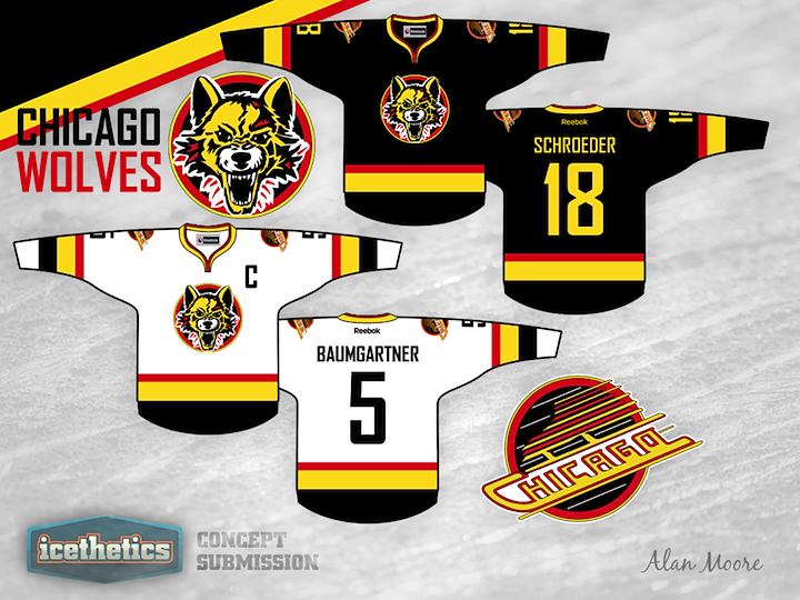
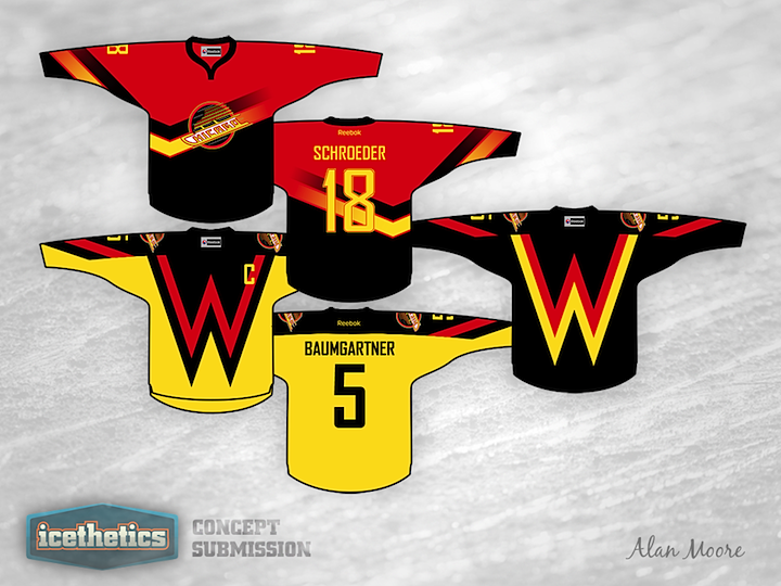
I know it's Minor League Week, but this just has to be wrong in so many ways. Alan Moore's Chicago Wolves look a lot like the Vancouver Canucks of the '90s. Of course that's by design but it's still a strange sight to see. And just for fun, he threw in a couple of alternate designs.
Designed by  Alan Moore
Alan Moore 
Reader Comments (15)
Well, the Vancouver Canucks organization has literally used every color from black to yellow to mustard yellow to red to silver to blue to darker blue to green to lighter green to burgundy in their perpetual quest for a lasting identity......I'm not the least bit surprised. These aren't half bad at all.....The Chicago Deep Dish Pizzas!
This, this, 1000 times THIS!
YES YES YES YES!!!!!!!!
The Chicago skate logo, classic! the flying W, Ugly classic vintage!
Such a good idea bringing the colors back. 5 stars.
I don't mind these jersey's, but I can't say I'm a fan. I feel that perhaps they could have been a contender for being published on Friday, as they are a bit of Freak Out. However, if they are not deserving of that, I'm wondering what's going to come out on Friday...
As a side not, the alternate design remind me of old rubgy shirts of the 70's and early 80's in the UK as opposed to hockey shirts. I think the W looks odd, certainly odder than the origianl V. They are nice tries at this mish mash of clubs.
I am so using that Chicago plate-of-spaghetti logo as an avatar the next time the Canucks play Chicago in the playoffs.
Alan Moore...? THE Alan Moore...? :p
Seriously I think the problem is how the logo is colored. That Canucks identity has potential.
You know what W stands for?
Winning.
That's you, Alan. Winning.
UUUUUUUUUUUUGGGLYYYYY
Oh no - the front stripes were changed to a "W" but not the lower sleeve stripes.
And, I LOVE the Chicago skate logo.
I didn't know that nolan was still playing
Met him in Portland in the 90's, nice guy
Hmm.. Chicago Canucks.., that doesn't sound sacrilegious to a Hawks fan or anything :P
Hey everyone, thanks for the feedback!
I thought I should declare that I am indeed a dyed-in-the-wool Canucks fan, so the sacrilege of the design is not lost on me at all. In fact, I took immense pleasure plastering the Canucks brand all over a Chicago-based franchise. The fact that the Wolves already wear a similar colour scheme and desperately need an update just made this too easy, not to mention the Flying W and Chicago spaghetti skate options.
@Dubs: The W design was a major headache figuring out a good placement, and it's still not perfect (the capatin's C is in a weird spot). I just thought it was too great an opportunity to turn the "Vancouver Flying V for Victory" into a "Wolves Flying W for the Win" to pass up.
@Neonix: Haha it's my real name. My parents had never heard of the Watchmen or V for Vendetta back in 1991... Anyways, I'll concede the wolf primary is definitely not the strongest part of the design; I was just reluctant to abolish the wolf from the logos entirely, and too lazy to come up with a new primary. I still think it's an improvement over the grey wolf with green eyes in front of a clip-art stick-and-puck background though...
@Simon: Good spot. That was a lazy oversight on my part. Also notice the yellow stripe on the front of the black W alternate never made it onto the sleeve? Sloppy.
my favorite canucks colors, these concepts are bad ***
i am one of the biggest wolves fan you'll meet and i think this is great. this applised mostly to the chicago skate logo.(especially since it would stick in the craw of all the blackhawks fans that i have to live with.)
that being said, the wolves have the most perfect logo and sweater in hockey and should not be changed.
very cool concept though. if you kept the regular grey version of the logo, i'd have no problem with with as an alternate. (our alternate is horrible, which is the ONE problem i have with the club.)
Do any of you folks know that "The Hockey News" voted the original Chicago Wolves logo the best minor league logo multiple times? Also that happened to be the first minor league logo to win more than once? I say keep the original logo and colors. As for an alternate sweater, no problem. Take it easy.