


Monday
Jul232012
0156: Affiliate Swap
 9 Comments
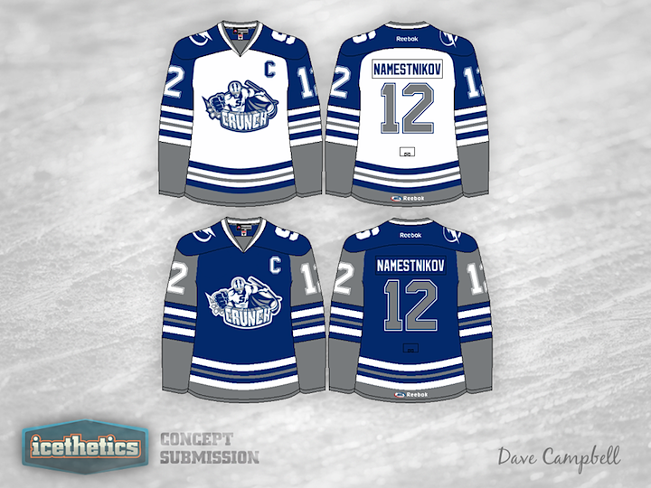
This summer the AHL's Syracuse Crunch and Norfolk Admirals swapped NHL affiliates. So that's our theme for today's concept post. First, Dave Campbell put together a pair of jerseys for the Crunch, who recently unveiled a new logo after announcing a new agreement with the Tampa Bay Lightning. These blue and grey sweaters could work really well!

Meanwhile, the Admirals hooked up with the Anaheim Ducks in the aftermath. They've announced no intentions to redesign their logo or uniforms, but if they did, Justin Nahhas has a really neat look in mind. The only fault I can find is that the crest is almost unreadable. Could use a little more contrast. Otherwise, we have a couple of nice sets today.

Reader Comments (9)
i like the admirals the jersey looks great the crunch jersey looks to busy to me
I'm confused about the '9' on the shoulder of the Syracuse jersey. Am I missing something?
Only other thing is with the Admirals jerseys, Oberg belongs to the Lightning organization, so he wouldn't have the Ducks colors =P
Admirals logo used in concept is old logo. Follow this link for more -- http://www.sportslogos.net/team.php?id=508.
Think current logo would look even worse in Ducks colors.
Love the Admirals jerseys. As a Ducks fan I can tell you we'd love to have jerseys similar to those in Anaheim for the Ducks. Only complaint would be maybe add some more color somewhere/somehow. But even then it's not necessary.
As for the Crunch jerseys, I love the away, but the home has too much gray. If the gray on the upper arms was replaced with blue it'd look amazing. And if the gray was replaced with black it'd be even better. Just my opinion.
The "9" on the shoulder is actually an "S". The same one found one Crunchman's chest.
Hey guys thanks for the positive feedback! Now that it's pointed out, I totally agree the wood mark is way too dark. And Caz I do believe that's an 'S' not a '9'.
Caz:
I think that is supposed to be the S on "Crunchman's" chest, not a 9... hard to say for sure with how it hits the edge of the uniform.
I have to say, I was not a big supporter of the new/old Crunch logo when I saw it, but I really like the jersey that you put together around it, it just all blends well together. As for the Admirals sweater, I really like that center logo in your design field, and would like to see that entire crest, circle stars and all, on the jersey instead of simply the wordmark. Also I think maybe the star AND the anchor on each sleeve might be too much...