Monday
Sep242012
0219: Kings Re-Bourne
 Monday · Sep 24 · 2012 | 9:00 AM PDT
  15 Comments

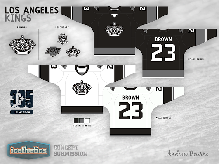
Andrew Bourne is back with the next team in his NHL makeover series. What are you thoughts on his monochromatic yet rather retro redo for the L.A. Kings?

Designed by  Andrew Bourne
 Andrew Bourne


Reader Comments (15)
the first Re-bourne that makes me think 'hey, this could actually work'
the monochrome colour scheme works well for the kings, even with the vintage crown logo, although I would like to see a slightly lighter silver.
I would push the striping a bit... it is a bit boring. for me the wide stripes are too wide and the thin stripes are too thin. also I would like to see the hem stripes more prominent on the alternate (whether that is simply making them wider, oir raising them up the sweater a bit).
Now this I like!
I agree with Colin about being a bit more adventurous with the striping and lightening up the dark gray/silver a bit.
I really like the home and away sets. Like Colin M. mentioned, the striping is a little dull, but I think this is an improvement over the pencil.
I think the 3rd though should be purple and gold - I find that 3rds which use the same colour scheme as the home jerseys are just dull.
Regardless - retro crown with monochromatic scheme works for the Kings. Good stuff.
Top two main jerseys are spectacular, the 3rd jersey is also pretty good but I could do without it compared to the other two.
These are sweet!
I am a life-long Kings fan and have lived in L.A. my entire life. I must say we miss the purple here and wish it came back. I'd like to see purple on these because it is a huge part of our history. Personally I would say these jerseys look like practice jerseys. I was sad because I was expecting more from Andrew Bourne after seeing the other teams.
No, no, no, no ,NO!!! If there is one thing the NHL doesn't need it's another black jersey. We need more colourful jerseys back in the NHL. L.A. should go back to the original purple and gold jerseys, all the black and white ones they have worn look crappy.
I like the design elements of merging a few different looks from over the years for the team. The only thing for me is... I keep thinking that I'm looking at a black and white printout of what should be a color jersey. It's a little too grey-scale. I wish L.A would remember the team is called "THE KINGS" and bring back the ROYAL purple and gold..Maybe the team's next rebranding designers need to go to New Orleans and get thier MARDI GRAS ON!!
The crest logo needs to stay dead, but otherwise pretty good.
All I can say is "cool"! Nice job indeed. Particularly like the font for the names/numbers.
As much as the purple and gold looks great, those colours are left reserved for the Lakers. Especially after the cup win, the Kings are undeniably silver and black, but that original crown logo is something else. Truly iconic, and should have been used in conjunction with the silver and black colour scheme.
Although I love all of the feedback, I think Patrick nailed it here. I decided on the Black/Silver/White for many reasons, but one in particular is because LA won the cup in black/silver/white. That will always be remembered.
The jersey design largely came from the original 70's era Kings but I wanted just a bit more out of the striping. So, I added the thin stripe below the overly thick stripe.
The Kings have plenty of logos to choose from but to incorporate their entire history, I used a logo from each design era (if 'era' makes sense...) Their original crown looks great in black & white and their shield logo is very unique (It is small but I replaced the crown in the shield with the original crown).
Over here in the Northeast, when I think of the Kings, I think Gretzky and the uniform he wore after being traded by the Oilers. So, the Kings word-mark from that time had to be included.
Gotta agree with Patrick, purple and gold is so closely identified with the Lakers here in So-Cal and after winning the Cup, I think black and silver is here to stay. Purple on a 3rd jersey in honor of the team's past would be great.
Sorry - for me the only acceptable Kings colours are purple and gold
This design really nailed it, as far as I'm concerned. Clean, and simple, yet elegant. The original crown is a perfect fit with the monochromatic colour scheme. Great job!