


Saturday
Sep292012
0224: Winter Classic Simplicity
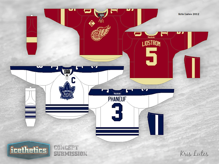
Here's another Detroit-Toronto Winter Classic concept. I'm posting this even as we wait for word on whether the game will even be played at all. I like this one because it's simple and quickly identifiable. Nobody turning on the TV on January 1 would have to look twice to see which teams were playing. Now let's just hope they get to play.
Designed by  Kris Lutes
Kris Lutes 
Reader Comments (4)
Can we all please just forget that the Cream Movement never happened? It is getting as bad as the use of navy & deep red these days or black for black's sake in the 90s. Using this fake aging just makes 90% of these jerseys forced. Replace the cream with white and the Wings jersey looks much improved.
A green St. Pat's jersey would be nice (and another lovely introduction of green into the league).
"NoMoreCream"'s post sounds like a lot of mine, when it's come up.
This isn't baseball, where a cream-colored uniform is going to usually look more white when out in the sun, standing over a field of green grass and brown dirt, with most players isolated, and the opponent wearing all-gray (or gray pants with a dark top). Hockey players are playing on a white surface, surrounded by white boards (well, aside from the ads on them), and cream, or "vintage white" or whatever BS you want to try to spin it as, just doesn't look right when it's being used in place of white. It makes me want to throw bottles of Clorox at the players wearing those unis!
The only teams that should be permitted to wear a color resembling that are the teams that have actually incorporated such a color into their normal schemes. Minnesota's "wheat" and Phoenix's "sand" get a pass, but that's about it (and Phoenix currently only actually uses the "sand" outside of logos on their third).
I would rather not see the Wings wear a lace-up collar ever again - the 2009 WC uni was the first time they'd ever gone that route (they were the last team to still wear crew-cut collars, all the way to 1982, and I know since I saw a Danny Gare sweater from that season up close this past winter!), and I just don't see how people like that look - the laces are ugly and obtrusive, and moreover they serve no function, since the insert panel with the NHL shield makes the collar functionally identical to the regular Edge V-neck anyway.
Interesting call to mix the pre-1967 logo, the 1967-70 three stripes, and the 1970-92 sleeve-length stripe on the Leafs uni.
I'm on board with the anticream movemetnt and while we are at it can we ban "vintage brown" pants.
I don't know how many more times we can go around the mulberry bush with these two teams. The Maple Leafs are always going to be blue and white (exception: St. Pats) and the Red Wings should always be red and white. All the concepts for this 201_ Winter Classic are just blurring together.