Sunday
Nov102013
0632: Orange on the Island
 Sunday · Nov 10 · 2013 | 9:00 AM PST
  4 Comments

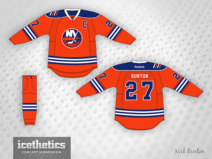
So you're not a fan of the black and white Brooklyn jerseys? How about seeing the Islanders go back to an orange third when they move? Nick Burton has that covered today.
Designed by  Nick Burton
 Nick Burton


Reader Comments (4)
Why do Islander concepts always include the "four stripes" for their stanley cup? That was thirty years ago! No other team makes reference to their cups years later. I cannot understand why this remains an Islanders concept staple.
If black is really a big deal to Barclay's branding, I could see changing the strip between the two whites to black. It would/could be subtle but could appease both sides possibly. I really like this concept though. I don't know why they haven't done this already or invert the current jersey to orange.
Interesting. The Isles have tried orange before, which looked pretty good, honestly. And I like the 2000's era four-stripe patch, a great homage to their four Cups of the 1980's. I wouldn't mind seeing it come back (as well as the navy blue jerseys they wore during that time), but that's unlikely.
I'd like them to see them bring back a mostly-orange sweater, and this is a good concept for it.
NASCARFAN160 - I'm not sure I agree with you on the looks of the last attempt at an orange jersey (especially not when worn by the person pictured) but I do like where this concept is going. I'm not completely sold on the striping on the arms and torso, but I think there is a lot of potential with this. Maybe a small patch on the other shoulder with the Brooklyn Bridge to tie the old in with the new - as long as it doesn't end up too big and tacky.