


Monday
Apr082013
0415: Modernizing Pittsburgh
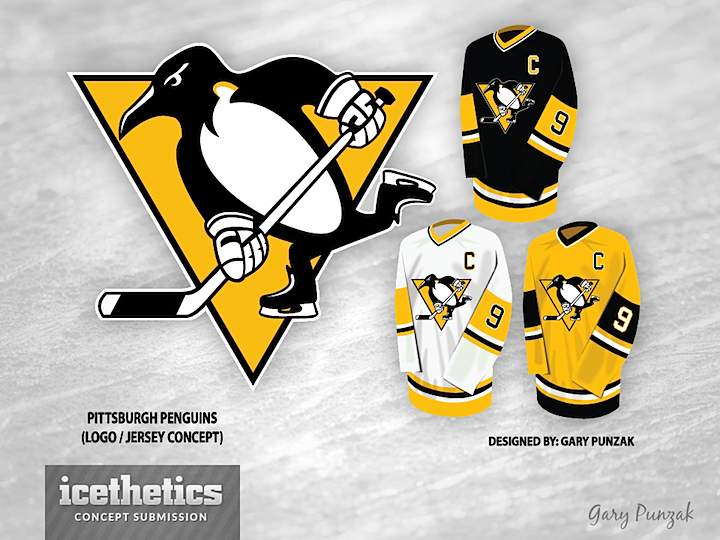
Gary Punzak tells me he started tweaking the Penguins logo to see what it would look like with modernized equipment. He ended up with a whole new concept that should please a lot of Pittsburgh fans. This comes on the heals of the disappointing revelation by a Pens beat writer who says the team will not have a new third next season. I think a lot of folks were hoping for something like this.
Designed by  Gary Punzak
Gary Punzak 
Reader Comments (23)
I like the logo updates and the jersey is a sure winner! The white jersey is too white though. Maybe some more color at the bottom of the sleeves.
Wow! I love the minimalist type concepts with bold colour schemes and this certainly fit that bill. One of THE BEST concepts I have seen on this page.
How can anyone see jerseys like this but justify keeping the bland vegas gold?
love it. not sure i like the yellow alt, but this is better than what they are currently wearing.
Really the only good thing about the logo is fixing the ridiculous mess that is the Penguin's bottom hand. Beak and Neck area look weird. Black jersey is great, the White one is ok except that it needs more black on the sleeves, and i was never a fan of all Yellow Pens' jerseys.
I wish the Penguins went back to jerseys like these. I think it's fantastic when all the teams from a city wear the same colors, kind of unifying the entire city's fans, and the Pens screwed that up with "Vegas gold". Seattle's emerald green and blue, LA's old forum blue and gold, you'd instantly know where that team is from.
Send it in!
Pens, as much as I don't like them, should seriously go with this look. That would look great!!
I'm not a Pens fan but I would buy those jerseys in a heart beat. They definitely should get rid of Vegas gold.
Anyone that has seen my past post concerning Pens concepts knows I am a long time Pens fan and I have been critical of most of the concepts! I actually like this concept, I would tweak the skates a bit though, they kinda look like the old Bauer Turbo skates....lol! Well done Gary, a big Bravo Zulu to you!!
These are 10 billion times better than the unbelievably ugly jerseys they wear right now. I would love to see the Penquins use these jerseys.
This is amazing, one of the best and most refreshing "new looks" that this site has ever seen. Very classic. The yellow is excellent, and I especially love the alt! Though after reading LMNOP's comment, I want to know what's going on with the neck of the penguin.
Thanks to everyone! Never would have thought id get this much of a posotive response! I just tried to keep it simple and clean up the logo. Just going with a logo and color scheme that me and most other Pittsburghers would like.
- the notch in the neck was suppossed to be like the middle of the chest, kind of like very simple muscle definition. I was back and forth on adding it but it look very plain with out it.
Again thanks for all the comments
agree with most that the Vegas gold should be a goner. The yellow works a heckuva lot better. Penguins gave up the blue to match the city's other teams, Pirates and Steelers, which use the yellow
Looks too goo to be true! I love the thick collar.
the pens need a change but I want to see them make something new. I like the idea of going to a classic look but everyone is going back to what they had in the '80s and '90s and I want to see something new. Mario won cups in that, let sid win cups in his own classic jersey.
great work Gary. This is a very solid concept from the logo on.
Keep it up, i too hope that one day Pitt will get back the yellow. It will look just too good on HD. And that yellow jersey looks fantastic.
Gary, thanks for the clarification. You deserve all the accolades!
@ ROB S. gotta question for ya! Lemieuxs childhood team, was the Montreal Canadiens! Have their uniforms/logos changed with each new superstar that they get?? NO they don't, because the Uniform/Logo is greater than the name/# on the back! The Uniform/Logo is the teams identity not some superstar! LOVE Sid and company but players come and go like clockwork
This is perfect in every possible way. I'd LOVE to see the Penguins wise up and get back to the same colours as their Pittsburghian bretheren.
As a Pens fan, I can't say that i like too many things here. The gloves and skates look more modern, okay i get it. But i like that quirk in the look of the skating penguin. He doesn't have to be edgy or even current. There is something to be said about a 'classic' design. look at some MLB logos and how goofy some of those are. This logo's eye/beak changes just look 'off' to me, and im really not sure whats going on at the top of the pen's chest (trying to incorporate robopenguin element maybe?) Im not saying im a huge fan of the vegas gold, but i dont see Pens management deliberately changing it to yellow anytime soon. i think the pens just need a new jersey design (which is what i tried to do in a concept i submitted a while back that i dont think was ever featured) to establish or reconnect with a visual identity under their current colors. Not trying to incite a riot, just felt a voice of opposition was in order
@91Pens92 Exactly, Montreal's jerseys are true classics that have should stay around forever like for example Chicago and Detroit, I never want to see those change. These, yes we won two cups in them, but were just part of the 80's and 90's trend. I wouldnt mind seeing them come back but I just don't like how everyone is going back to old jerseys, either keep them from the start or get something new. We've changed full sets 3 times since then, that was a different generation. I only bring up the Sid point to show that. I don't want Sid to get his own jersey because he's Sid but I want this generation to be remembered for wearing something besides Mario's copy and these current Edge jerseys. Create a new classic that you don't have to change every 10 years or so.
As a Pens fan....PERFECT. I wish this was our jersey set.