Monday
Jun102013
0478: The Isles by Hand
 Monday · Jun 10 · 2013 | 9:00 AM PDT
  12 Comments

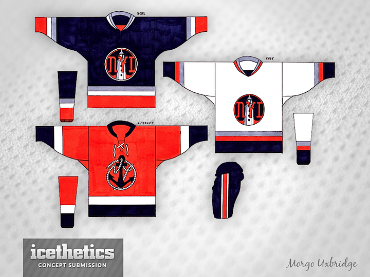
We've got a first for the Icethetics Concepts page today! Morgo Uxbridge created his New York Islanders jerseys not with a mouse but with a pen. These hand-drawn designs are absolutely stunning — especially the attention to detail given to the crests. Speaking of which, take a moment to really appreciate the logo on the orange third jersey. It's a thing of beauty!
Designed by  Morgo Uxbridge
 Morgo Uxbridge


Reader Comments (12)
Very cool alt logo! I didn't see the "NY" at first - I love how sneaky it is. Looks great!
I really dig the logo on the alternate. Very creative, classic look. The primary crest doesn't quite work for me, but I think it could be improved with a little more work.
Really well done.
Brings back memories... as a kid that's how I used to do it!
Great job !
I can never get truly excited about a concept like this, because it is so well done, clever, original, and identifiable to a certain franchise, and I doubt anyone connected with NYI will give this a look or a thought. These are the types of designs and logos that NHL franchises should be looking at and coming up with.
You know. I am really not a fan of these jerseys at all. However, I am stunned that they were done by hand. That is impressive.
And yes, that alternative logo is pretty cool. I would like to see it on a different jersey set.
that third is pretty rad
Oh wow, didn't notice the "NY" either, well done!
Is there anyway you can upload that Alt logo somewhere man? That looks fantastic!
That third jersey logo is gorgeous. I wish we could see it on the ice.
The alternate alone makes this worth seeing on the ice. The primaries aren't great, but would still be better than the current third jersey.
Hand drawn?? Fantastic. Great subliminal NY on the alternative.
This is brilliant--- you should be making a fortune with your obvious talent