Tuesday
Jun182013
0486: Fixing the Avalanche
 Tuesday · Jun 18 · 2013 | 9:58 AM PDT
  18 Comments

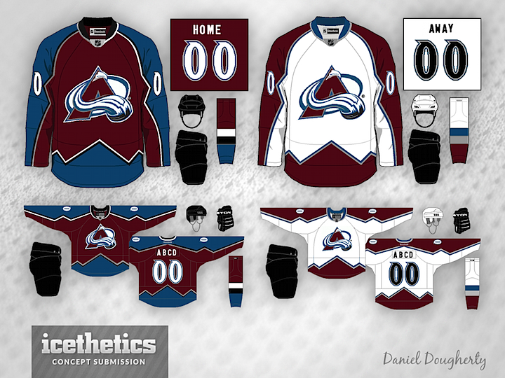
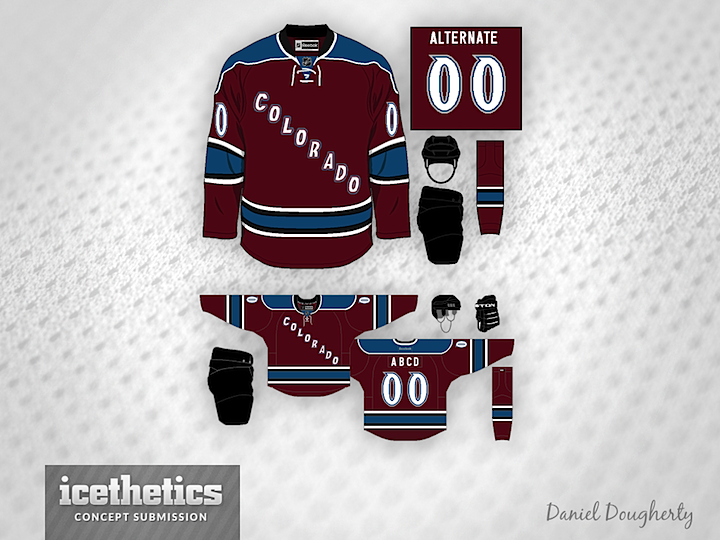
With the uniform changes in Nashville and Dallas in recent years, the NHL is slowly improving. But one team that still needs to be fixed is the Colorado Avalanche. Daniel Dougherty shares this set of Avs sweaters with us to prove it can be done.

Designed by  Daniel Dougherty
 Daniel Dougherty


Reader Comments (18)
The 3rd jersey design is near perfect. Just put the Avs crest on instead of the city name.
That's pretty much what the Avs need to do. A few tweaks here and here, but that's the basic idea as a whole.
I want to create jerseys, anyone have a good and solid templates to share?
PERFECT!!!! SEND THIS TO THE AVS AND TELL THEM TO MAKE IT HAPPEN!!!!!
These are nice but I wish the Avalanche would redo everything about their look. Start from scratch. Now that Dallas has changed Colorado has my least favorite uniform in the league.
Good designs. I really wish Colorado would drop black from their scheme. It would improve the complete design a lot more in my opinion.
i never did like the jagged edges when the avs did it before. it is just so minor league-y.
agree about the 3rds. those are awesome. slap the crest on there and that should be the primary.
Lose the jagged, mountian stripes. That's total minor league. The third is almost awesome. Add the logo insted of the name and that may be the perfect look.
Those are great! The only thing missing is an secondary logo, bring back the foot print in the snow, or what ever it is called.
I think there is nothing good about the Av's the color combination is awful and the black has to go. The only jersey I liked was the maroon one with Colorado diagonally across the front ( I purchased one and the mispelled it Coolrado!) I think it needs a major redo, the bottom one works for me if you can get rid of the black pants and helmet
I love them! I agree with Brian!
I am tired of the same old jerseys, with the 3 lower stripes and making everything 'classic'. I love this jersey because it is different and nobody else has it. That's why I loved the Avs jerseys so much when they were starting out.
As an Avs fan, I would wear all 3 of these. Love them.
I would spend thousands of extra dollars on Avalanche merchandise if they switched to these jerseys! THOUSANDS!
I love this look, the mountains need to come back. They make me a proud Av's fan. But I have a couple of tweeks that could make it a little better:
-add the Yeti footprint shoulder patch
-change the collars on both the home and road to what they were before the reebok change
-switch the black on the home socks to the silver, the black just doesn't look right there
- either keep the current 3rd jersey they have or switch the burgandy and blue on yours, I think it looks better with one of each color than 2 burgandy and one white
As was alluded to before, I also wish the Avs would get rid of the black helmet, pants, and gloves. They have these amazing maroon and blue colours to work with and they compliment it with black? No no no.
For whatever reason, i really liked the Avs' old burgundy third. Just so simple, yet pretty unique. this concept is ok, but doesn't really need the shoulder yoke. and if the Avs are to be "fixed", the mountain peak striping has to be brought back. every jersey in the NHL is so boring nowadays. same wide stripes on bottom and sleeves and maybe a different color shoulder. zzzzzzz
Put the foot back on the shoulders and this jersey is PERFECT.
This is just perfect, an excellent nod to the team's first years. One of my favorite jerseys of all time, and I'd very much love to see them make a comeback.
Problem is, though, would they be able to fit that on the Edge template? If they could have, I think they would have.
The mountain striping on the sleeves looks stupid. I don't mind the mountain stripes along the hem though. Avs could use an update with some different colors.