Tuesday
Jul022013
0500: A Century of Leafs
 Tuesday · Jul 2 · 2013 | 9:00 AM PDT
  7 Comments

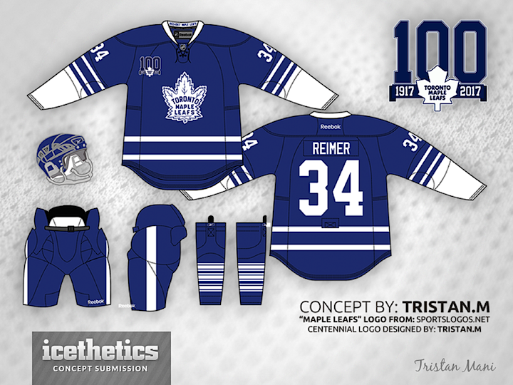
We mark a Concepts page milestone today with the marking of a Toronto Maple Leafs milestone by Trisan Mani. Our 500th post is a special uniform and logo for the Leafs' 100th anniversary — which is still a few years away. It's a sharp look. Worth the wait.
Designed by  Tristan Mani
 Tristan Mani


Reader Comments (7)
Granted, there probably isn't a lot of variation you can do, and the Habs did have a second patch designed, but this one looks a lot like one of the patches used by the Canadiens a few years ago.
http://www.frozenpond.com/xcart/image.php?productid=6703
I like that the banner underneath in the logo goes straight across and doesn't do the whole "blowing in the wind" thing most clubs use. I think it looks really sharp. Loving the kit overall- I love the older, more detailed maple leaf crest.
My only qualm would something that's kind of nit-picky. Spatially, the left side of the 1 lines up with the inside fold of the banner, but the right side of the right 0 lines up with the outside banner tail. Not really noticeable to most, just my OCD, I guess.
I would prefer to see " 100 " in an anniversary logo in a white rather than in blue - it will help to see easier and will work better for an artistic sake. As far as that logo goes - not a very creative one. Tristan, perhaps, moving " 100 " below a white leaf would be a wise choice in my humble opinion. I don't like how a first " 0 " poorly connected to a top portion of the leaf. Ribbon itself could have been done more interesting , not that bland. On a jersey the hem and sleeve stripes don't match well plus making cuffs in white and not adding to a hem doesn't justify your concept. Perhaps, stripes on a sock would have been a wiser choice to apply on the jersey. Laces would be better in white, as well. Hope you don't mind my critique, Tristan. Good work here.
I'm not a fan of having all of that white on the forearms. Maybe change the sleeve striping a bit. Overall it's a very good look.
almost every single TML concept bores me. It's not that they're all bad or anything, it's just that there's only so much you can so with a Leafs jersey. Blue and white with minor variance in sleeve stripes. Honestly, you could throw just about any combo of logo and striping and it'd be a classic look(aside from the weird 70s jerseys and the 07 ones without a waist stripe)
If you darken the jersey a bit, and add white to the waist, you'd be retreading the briefly used Predators third jersey. That was my first impression of the design. Not that I dont like it. Overall, it isnt that bad.
i'm with your face's comment up above. toronto jersey concepts are always boring.