Entries in Steven Grant (20)

Wednesday
Jan292014

0712: Capitals De-Edged

i
506 VOTES

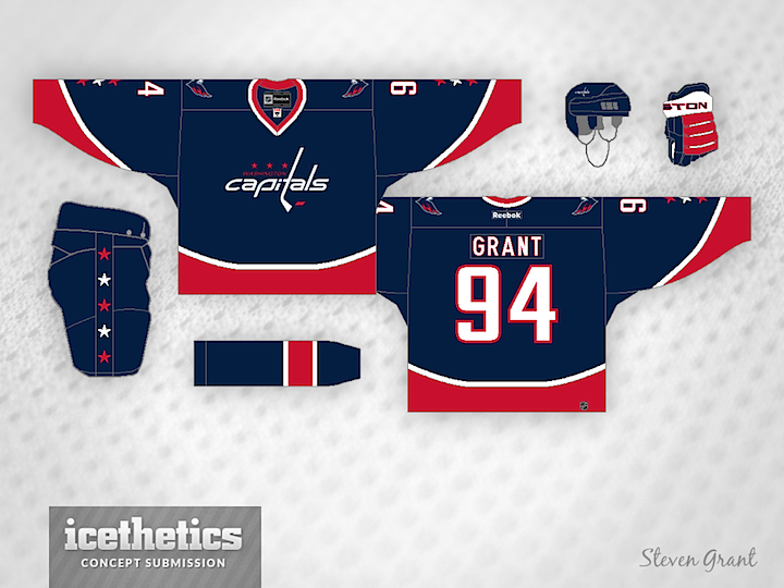
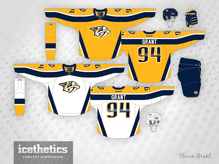
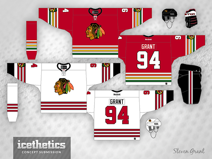
Steven Grant has been redesigning NHL uniforms by taking the Reebok Edge system out of the equation. Today he tackles a blue Capitals jersey with great results. The wordmark doesn't look half bad in white. Of course, personally, I'd still prefer to see an actual logo in its place.

Thursday
Jan232014

0706: Music City Revisions

i
627 VOTES

I don't love some of the details of the Nashville Predators' uniforms and I'm probably not alone. The apron strings criss-crossing horizontal stripes and all. So how about some striping revisions? I think Steven Grant has done a great job bringing back a little bit of the team's original jerseys.

Thursday
Jan092014

0692: Post-Edge Bolts

i
403 VOTES

Steven Grant has been on a mission to rescue the NHL from the grips of the infamous Reebok Edge jerseys. And he's been rather successful, as evidenced by this Tampa Bay Lightning set. He thinks the Bolts should revert back to their original Edge-era logos, however. As far as I'm concerned, give me victory stripes and a white shoulder yoke on the home jersey, and we've got a winner.

Wednesday
Nov202013

0642: Coyotes De-Edged

i
541 VOTES

Like many, Steven Grant has never been a big fan of the Reebok Edge jersey designs. So he's been slowly "de-Edging" the NHL. In today's entry, he tackles the Phoenix Coyotes with a sharp mix of old and new.

Wednesday
Oct232013

0614: Military Jets

i
623 VOTES

Steven Grant has been trying to de-Edge the NHL. His latest attempt is for the Winnipeg Jets. He says, "This concept is inspired by the old RCAF jerseys, and also a bit by the WHA Jets jerseys. I wanted to further the military look created by the logo, so I used stencil numbers."

Friday
Oct042013

0595: Colorful Freak Out

i
496 VOTES

Steven Grant has been working on a series to "de-Edge" the NHL — returning the jerseys to the days before 2007 when Reebok changed some things. But I can't say I'm a huge fan.

Steven wrote, "I haven't seen many concepts for the Blackhawks that use the colours from the logo in the striping, so that's what I tried here."

Thursday
Sep122013

0572: Something Devilish

i
419 VOTES

Today, Steven Grant shares an interesting re-striping of the Devils' uniforms. Here's his explanation:

The Devils seem to be a tough team to make good concepts for, but hopefully this attempt isn't too bad. It's basically a combination of their 1982-92 and current jerseys, but with the sleeve stripes moved up to where the TV numbers usually are, and the shoulder yoke extended down to those stripes.

By the way, tomorrow our Freak Out Friday series falls on Friday the 13th!