Entries in minor league week (25)

Wednesday
Apr042012

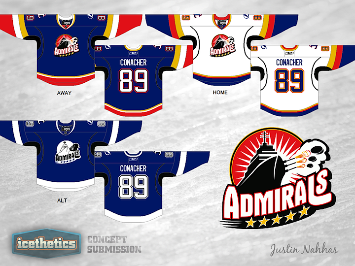
0046: Admirals With a Dash of Lightning

The Norfolk Admirals are in the midst of a record run, an insane winning streak. It's not just breaking AHL records, it's breaking records of other sports leagues. So while the Ads continue to mop up anyone who would be dumb enough to face them, how about a couple of concepts? It is Minor League Week, after all. Justin Nahhas has created a set of Admirals uniforms based off the third jersey of their NHL affiliate, the Tampa Bay Lightning.

But that's not all for today. I want to revisit a classic.


This is one of my all-time favorite concept designs. John Quincy King overhauled the Admirals' look to match new Lightning's new look. It was first posted on Icethetics last May, and since we were talking about Norfolk, I thought a reprise was in order.

Tuesday
Apr032012

0045: Remaking Rochester in Buffalo's Image

Minor League Week proceeds with another AHL franchise, one not so much in need of a rebrand. The Rochester Americans were hit hard by their league's switch the Reebok Edge uniforms, but it wasn't long before the problems were rectified. So that's not what this concept is about. Instead, Chris Wright demonstrates what the Amerks might look like if they wanted to look more like their NHL parent club, the Sabres, with which they were recently reunited. It's probably more of a lateral move than anything, but it's an interesting notion. Anyone else want to take a stab at redesigning AHL team sweaters to match their NHL affiliates?

Monday
Apr022012

0044: Redeeming the Whale

Yesterday, we got a little taste. Today, the full meal. This morning's double-feature marks the start of Minor League Week. For the next few days we'll be enjoying concepts for minor pro teams, which often tend to get overshadowed by the NHL on this page.

As you can see, we're kicking things off with the Connecticut Whale, one of the teams most in need of a complete redesign. Their current look is an absolute joke and I cannot say it enough. And as jokes go, you realize just how not-funny it is when you see what Mike Ivall has come up with. His identity is the perfect mix between the old Hartford Whalers and the Whale's previous identity — the Wolf Pack. Overall, this is one of my all-time favorite concepts.


Now, then. I'm an adult and I realize it's unreasonable to think the Whale would simply scrap entirely the new brand they're trying to establish. Maybe something a little less dramatic would get the job done. To that end, may I recommend Ryan Haslett's concept? I can't say I'm a fan of the logo or the striping, but at least it aspires to better days in Hartford.

Sunday
Apr012012

0043: A Fool for the Moose

Taking a break from Winter Classic Weekends to celebrate April Fool's Day! Last year when we found out the Atlanta Thrashers were headed to Winnipeg, the rumors flew. We'd heard from Mark Chipman that he had no desire to resurrect the Jets and, in fact, every intention to carry on the successful branding of his AHL team, the Manitoba Moose. But we were fooled. On Draft Day, it was confirmed the franchise would be named the Jets. Still, Tyler Rodgers has sent in what may have been a great upgrade to the Moose brand. Shame we'll never see it go beyond this page.

Page 1 ... 1 2 3 4