


Fixing the Cats' Thirds
 5 Comments
Hope you're enjoying your morning. I've got some new concept art for you as part of the re-launch of the Icethetics concept format. From now on, I expect to have more frequent posts with fewer items.
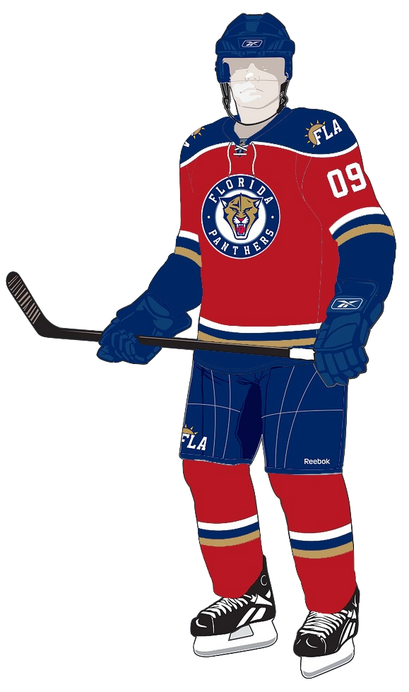
Today, three artists take a look at what the Florida Panthers' probably should've done with their new third jersey this season. Dark blue has been done. And just because you add a new color to your arsenal doesn't make it acceptable.
 Peter Cabral Peter Cabral |
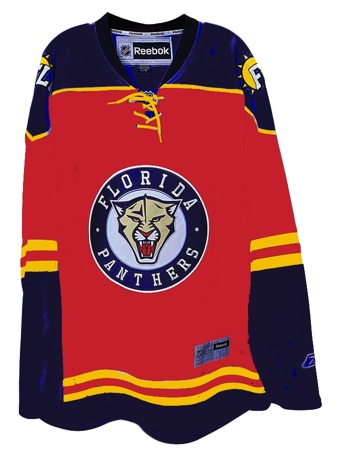
This is probably closest to what the Panthers should've done — and it's the closest to what they actually did. It keeps the rounded shoulder yoke intact as well as the new logos. The only major change is to the color of the sweater itself — and they need to bring back the red. One other neat change is the gold. It works really well with those shades of blue and red. But you may prefer the current yellow. For an idea of what that might look like, look no further... |
 Chris Fraterrigo Chris Fraterrigo |
That's the true Panthers gold. But personally, I think either way you go, red is definitely the winner here. The point of the alternate uniform is to show off some colors your home crowd isn't used to seeing. They skirted that with the powder blue splashed about. I'm not saying Florida has a bad third jersey, because that couldn't be farther from the truth. I just feel like they missed an opportunity to return to their roots a little. The Cats wore red for years. As a matter of fact, their first blue sweater was a third. |
 Glen Cuthbert Glen Cuthbert |
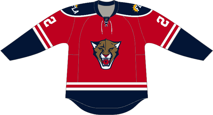
This last one may be the best version. While it's differences are slight, they are significant in their simplicity. First, drop the gold. Just because it's a third sweater doesn't mean it requires a third color. Red and blue work perfectly and separate the sweater from the home and road jerseys. Second, the circle around the new panther head is not important and while to some it may elicit the feel of old-time hockey, all it really does is paint itself as a Penguins/Wild/Blues copycat. Still, it may need a white stroke to help it stand out a bit more on its own. Everything else works. The striping is great as well as the shoulder yoke and new logos. There's nothing else I'd change. |
And that wraps up the first edition of the new concept format. Hope you enjoyed it and I hope you enjoyed all your awesome Christmas presents this morning!

Reader Comments (5)
I like the format. Though I half expected an Xmas Freak-out Friday post, lol. The first and the last Fla concepts get top marks in my book. They look five times better than what is actually worn. I've probably said this dozens of times, but Florida missed the mark so bad. Only thing I can think light blue can mean is that they are moving to Quebec. (again, lol)
For a true Panther's flair, I'd go with the 2nd one.
Love all of them so much more than the actual third. The first one is tops in my book. Its what they should have done from the start.. although i really would have removed the FLA patch and kept the old sun palm and stick logo, i think it just screams flordia hockey. Anyways great job guys way to once again create something much better than is actually on store shelves.
The current florida third with the baby blue makes me wonder what they might do with their home and away kits.. as i remember reading something saying that florida was moving in this direction and they put alot of thought into the color schem based on their division.
Good job guys, merry Christmas!
Glad to see you also removed the stripes from the trunks. They looked suspeciously like swim trunks with them on.
This is the color the Cats should've used. Great use of the original Florida Panthers' red jersey. Unfortunately, they choose to look like the Penguins' ugly brother.