I'll be making the long cross-country journey back to the Sunshine State today. Sad.
This is the final of five auto-posts featuring new concept art and it is being written nearly a full week before it will even see the light of day. Trippy. Or not.
You knew it was coming eventually. Not a single Canucks-centric post all weekend. How can this be possible? I saved it all up for today, that's how. Readers seem to send in more Canucks concepts than any other team. I don't know if it's the team's undying identity crisis or the possibility that Canada somehow funnels its most artistic people into one corner of the country.

 Matt Marczel Matt Marczel |
We'll kick things off with my personal favorite. Matt Marczel's concept depicts the ideal Canucks identity. It's not plagued by spaghetti, corporate interests or over-simplification. That logo represents Vancouver and Johnny Canuck. And it incorporates the green and blue to boot. What more could you ask for?
The design also manages to hang on to its history by keeping the modernized stick-in-rink logo on the shoulders. If ever there was a 40th anniversary jersey that could spell perfection, folks, this might as well be it.
What's even better is this set paves the way for a brilliant green third jersey.
|
 Jared LeBlanc Jared LeBlanc |
Jared LeBlanc has provided us with just such an example of a green third. It certainly shouts Reebok Edge but it shows a willingness to accept the things we cannot change and work inside certain parameters.
That being said, the curved tail of the sweater may be rather exaggerated. We get it.
As long as the greens matched up, there's really no reason that Matt and Jared's designs couldn't form a complete package here. Jared's even offered a nice pants design.
|
 Ryan Haslett Ryan Haslett |
Continuing with Matt and Jared's ideas, if it's a special event, vintage type design you're looking for, Ryan Haslett has the answer. He's gone with the "vintage white" and the new VC logo.
Do I smell a Winter Classic coming? Though to be fair, all the previous Winter Classic jerseys have either taken elements or entire jerseys from actual historical record. This would just be vintage for its own sake. Not that that's bad.
Could I be any more equivocal? The point is these are all great designs but what really needs to happen for the Canucks is they need to choose one and commit to it — for more than a few years.
|


 Kevin Krilow Kevin Krilow |
This next concept by Kevin Krilow focuses on the full-body Johnny Canuck logo. It's just as good as some of the previous artwork so what can you really say? Now it just comes down to personal preference. Do you prefer the full body or just the head?
You know where I stand but that doesn't mean I'm right.
This set comes with a home, road and alternate jersey. Surprisingly, it's the home and road sweater the make use of the text logo. Not necessarily bad, but uncommon.
|

 Ryan Broda Ryan Broda |
The last one had to be an '80s recreation. You just knew it.
If the Canucks never introduced the orca logo in 1997, it's entirely possible their current Reebok Edge uniforms could look something like what Ryan Broda has come up with here. It features an orange (some call it red) alternate and gold vintage jersey. Though I'm surprised the Flying V hasn't found a place on the gold sweater.
The red/black/gold stick-in-rink logo is even there on the shoulders of all four sweaters. Glad to see it there. It was the cornerstone of the team's original identity and even if it can't be center stage anymore, it needs to be part of their look in some way forever.
The only drawback this set seems to have is the numbering and lettering styles. I think for these, you need to just stick with your standard block text. Don't try to be fancy.
|
The end. I hope you guys appreciate all the effort I put in to make sure there was new content on the site every day while I was gone.
I'll be back in town Tuesday night but have some errands to run on Wednesday so the next update to the blog/concept page may not come until Thursday. In the meantime, enjoy the archives!


 15 Comments
 Mark Komondor
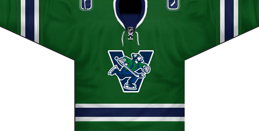 Adam L'Italien
 Brian Brideau


