


Your Sunday Concept Fix
 15 Comments
I've been getting some great concept art submissions in the past couple weeks, but I wanted to keep Haiti at the top of the page for a little while. I just added a few new items to that post, by the way. But now I think it's time to start sharing some of the other great artwork that's been coming in.

 Mark Komondor Mark Komondor |
We'll begin with the Penguins and a concept created by an artist brand new to Icethetics. These are his first submissions and he sure seems to know what Pens fans want. Imagine Crosby in the same uniforms that Lemieux and Jagr once wore when they lifted the Stanley Cup together. Of the first one, he writes:
He says the other is simply a combination of the jerseys worn just prior to and since the Age of Reebok. |
 Adam L'Italien Adam L'Italien |
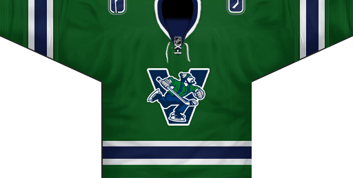
Adam's Canucks concept makes some revisions to the new Johnny Canuck/V logo introduced on the third jersey last year. He says, why not use the full-body JC on the V? But the most important thing about this jersey: it's green! |
 Brian Brideau Brian Brideau |
Rumors that the Predators plan to launch new home and road jerseys for 2010-11 could result in something like what Brian has come up with here. In fact, these should look familiar. I posted the first two jerseys two weeks ago. What's new is the blue alternate sweater Brian has now added. For the most part, I like this one. The striping is unique but the Flyers-copycat nameplate is what I think needs to be revised. I truly hope differently-colored nameplates do not become a league-wide fad. |
More concepts coming during the week.

Reader Comments (15)
I LOVE Adam's Canucks concept! I would buy that jersey in a heartbeat. I love how he incorporated a V-neck lace-up. My only suggestion is that the V have the same borders as the current Johnny Canuck V. A green border outside the white border and then the silver outlining outside the green border. Overall, kudos to a great design!
first of all i LOVE the penguins one. i think it would be the best jersey they'd ever had, if they wore those.
the canucks one is really cool, except for the fact that the jersey is the same color green as johnny canuck's shirt. a little weird, i would find a way to differentiate them. the preds one is cool too, except i wouldn't use that logo on the 3rd jersey. i must say, the checkered stripes have really grown on me.
The NHL already axed the Preds' plan to put the skull logo as the primary on the mustards. Its nice to see, but I doubt it'll ever be featured front and center.
Great Canucks concept. I never thought it would be possible to have a full body Johnny Canuck of the front of a jersey, but this concept executes it perfectly by adding the V behind it.
idk why but i sorta like the name plates but i can only stand them on a third or baby a two color jersey otherwise theres just to much going on
GOD!!! I am so tired of everybody's inexplicable obsession over this "Johnny Canuck" fellow! First of all, if they were gonna use this as the primary logo, they probably would've already. And second, it just doesn't look like a good hockey logo to me.
Love the Penguins concept. That needs to be their real-life uniform set.
It's official. Chris hates the Sharks.
I love the Jerseys for this week. The Pens one is absolutely solid. LOVE the retro look. And I love the new Canucks jersey idea, along with the Nashville jerseys. My only complaint is the checkerboard striping. It just looks kinda weird to me. Oh and same with the nameplate. It doesn't look good on the Flyers jerseys and it doesn't look good on them.
Kevin Y, I take it that you hate Johnny Canuck. And that's more than fair. We all have our own tastes on what we like and don't like. However, do you know the history of Johnny Canuck and why Vancouver's NHL team is called "Canucks"?
Johnny Canuck is the fictional folk hero of Canada and he was used as a symbol of Canada's armed forces during the Second World War. When Vancouver rejoined the hockey world in the mid 40s in the old Pacific Coast Hockey League(later Western Hockey League), team owner, Coley Hall named the franchise, "Canucks", because of Johnny Canuck. Therefore, Johnny became the official logo of the franchise. The character is truly Canadian and Vancouver was built on the lumber industry. Unfortunately, when Vancouver joined the NHL, the franchise was plagued by clueless ownership and inept management. This explained all the multiple uniform and logo changes and constant years of losing and mediocrity.
Finally, the Canucks have passionate ownership and management who are gradually rebranding the franchise and addressing the heritage of the Canucks name. The Orca is on its way out and Johnny Canuck, whether it's the V verson or the full-body version, will be more prominant in the Canucks' identity. That is why Chris, myself, and countless others love this historic Canadian icon.
Pens Jerseys = WIN
That Canucks jersey is it. The team should pay that guy money for the concept, and put it as its home/alternate jersey next year.
It is great. I love the logo.
I don't like the Canucks jersey for two reasons. 1) when I look at it, only one thing comes to mind: Whalers. 2) I agree with Kevin in that I don't think it makes for a good hockey logo. Historic, maybe, but its hardly a Canadian icon. Johnny Canuck is better suited as a mascot than a logo. It's just too cartoony (not to mention strangely swastika-esque) to make for a good NHL logo
I like the Preds concept but take a look at the original Penguins jersey from '67...surprised you missed that one. The home & away look really great. The Pens jerseys (both sets) look awesome. I like the colour update & it takes them away from their current ones that look like colour variations of Ottawa & Tampa.
Johnny Canuck is way too minor league, It doesn't even belong in the AHL. They could use it to promote youth hockey and as a mascot. Have the kids that come out during intermission wear those & offer them for sale in kids sizes only. There were some nice concepts a couple years ago that featured an update on the old skate logo & an aviator that will make better primaries when the orca decides to return to the ocean.
Ok, so now I understand where the Canucks name came from. But this does bring up another point.
I don't understand the reasoning behind using another franchise's history as inspiration for a completely separate franchise. I feel the same way about the "reincarnation" of the Ottawa Senators. They aren't the same franchise, so I don't think they should try to share the history, even if it's only with the logos.
That's the first decent looking Canuck logo I've seen. That includes both real logos and concepts I've seen here. It's just dectent though, but with some work I think it could be the absis for a new logo.