Monday
Feb012010

Southeast Visionaries

Time to ring in February with some new concepts! Icethetics artists have been hard at work on a couple Southeast Division teams these days. Let's take a look at what they're working up for the Capitals and Thrashers.


Glen Cuthbert

Just last Thursday I posted the news that the Washington Capitals are planning a special 35th anniversary celebration this coming Friday. The release tells us they'll wear a red jersey with a unique commemorative patch.

While the rest of us are getting our hopes up for some type of throwback sweater, Glen is being a little more realistic in his interpretation. Not as exciting, but likely what to expect in D.C. on Friday.

Ryan Haslett

But speaking of throwback, Ryan has taken some liberties by merging two different eras of Caps logos on this white jersey. Sad to say, I am not a fan.

But I must admit I always liked the Caps' blue and bronze days of the mid-90s and early 00s. It gave them a unique identity until they ditched the blue jersey for a black one.

Brian Brideau

I can always tell when a team's uniform design is unpopular with Icethetics readers — because concept art just comes pouring in. And evidently, the Thrashers are one of those teams.

Brian's jerseys may not look much different from Atlanta's actual sweaters — and honestly, the blue one isn't — but look closely at the white one. It's been simplified and freed of piping. Actually, it's really just a white version of the maroon third jersey.

Amazing what a few slight alterations can do.

Ryan Haslett

And to go with that design, imagine Ryan's dark blue sweater as an alternate. It harkens back to the Thrashers' original dark uniforms and a time when it was rare to see an NHL club with two different crests for their home and road jerseys. I'd love to see that make a comeback.
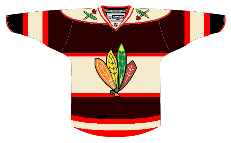
Glen Cuthbert

Now we finish with the artist, Glen, who began today's concept post. He offers up another maroon option for a Thrashers third jersey. Only the logos have been changed from the current alts. But even that is a major improvement.

Thanks to everybody who's been sending in concept art — keeping the reserves full. All of your amazing work will be posted soon!

Thursday
Jan282010

Freak Out Friday XLV

Friday is here again and you know what that means. Time to freak out!

I'm really trying to get back into the habit of having a Freak Out Friday for you guys every now and then. Of course it relies primarily on your submissions. So keep them coming!

This week's theme is Original Six. Just how horrible can we make these most legendary of teams look? The answers to that question ensue.


John B

I don't mean to always be picking on the Blackhawks, but I think we can all agree that gravity-defying feathers are not the way to go. Not by a long shot.

Even the colors have me a little concerned. Maybe we should just move on.

Charles Cadieux

Nope, shouldn't have moved on. Adding black to the Rangers color scheme. Now that's something I never thought I'd see. And obviously I hope I never have to. Hockey fans everywhere would revolt!

But since it is only fake, we can all rest easy. The tricky part will be removing it from your memory.

Randy Dudek

The Maple Leafs were the focus of the previous concept post and we had a lot of really nice artwork. Now it all goes out the window because this just beats everything. I mean, it's a Maple Leafs jersey covered in actual maple leaves!

Wonder why we've never seen a third jersey that looks like that.

In closing, all I'll say is I hope you are not bleeding from the eyes. More concept art (the good stuff) this weekend.

Tuesday
Jan262010

Time Traveling in Toronto

Whenever I put together a new concept art post, I often try to tie it all together with a theme of some kind. One of my more common themes is geography. Sometimes I'll take you on a virtual journey across the continent with a number of different teams. Tonight's theme focuses on one team and instead of traveling through space, how about time?

A handful of designers have reached back into history to come with their ideal versions of Toronto Maple Leafs jerseys — be they home, road or alternate. Now strap in. Don't want to lose anyone on the journey.


Matt Marczel

We begin with Matt's combination of present and recent past — though I use the term "past" loosely and you'll see why in a moment.

These home and road Leafs jerseys are pretty much a hodgepodge of the last half-century — especially when it comes to the logos. For the primary logo, he's got the leaf introduced in 1966 with the text stylings that came about in 1970.

The secondary/shoulder mark is based off of the leaf logo launched in 1938. And it looks to me like the T within it is borrowed from the TML shoulder patch which debuted in 2000. So that's a pretty good mix of history there.

Yoav Ickowicz

The oldest thing in Matt's design dated back to 1938. Yoav Ickowicz wants to go back at least another decade. His Maple Leafs concept is based on the less-common 1928 logo. He's also gone with three stripes on the sleeves and bottom of the jersey instead of the usual two.

It's great work and I sure hope we see more from Yoav in the future.

Ryan Haslett

So maybe you thought 82 years was far enough back in time. As it stands, the Leafs themselves are only 84 years old. But you'd be wrong. Toronto's hockey history dates back much further than that, as Ryan demonstrates with his Toronto St. Pats concept.

With the Devils dipping back into their past for green-infused uniforms this St. Patrick's Day, perhaps the Leafs might join them in something like this? Not to mention, I'm sure they'd sell like mad.

John B.

Now this last one may have you puzzled. I sure am. The only way I can figure it, not only would you have to travel to another time, but also another dimension to find it.

It's what I imagine someone from the 1950s would draw if you asked them to predict what the Maple Leafs would be wearing in 50 years. (Except that the CN Tower wouldn't come for another 20 years. Let's just look past that.)

Man, I just gave myself a great idea. What if we started concept contest where we try to imagine/predict what teams would be wearing (or even exist) 50 or 100 years from now? I think it would yield some interesting artwork.