


Thursday
Oct112012
0236: Rangers Re-Bourne
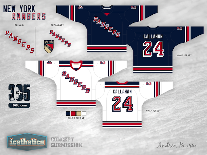
The Re-Bourne concept series has been running here on Icethetics for more than three months now, ever since designer Andrew Bourne came to me with his idea of making over the NHL. I really think he's been hitting his stride lately and today he shares his take on the classic New York Rangers. I think he's done a great job of respecting the history as well as bringing a modern take. And heck, this alternate jersey is even one I would buy.
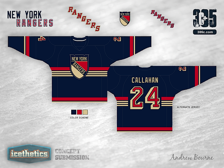
Designed by  Andrew Bourne
Andrew Bourne 
Reader Comments (10)
This is one that should be submitted to the Rangers with the note that fans would go wild for it. That is epic awesomeness!!
I'm a big Ranger fan and I will say that this is as good a job as you can do reinventing their jerseys. That being said, no Ranger fan here in New York ever wants their sweaters to change. Good concept to look at or think about, but if this were to actually happen, Ranger fans like myself would be pissed. I know I'm biased, but their current three is my favorite set in the league.
The "regular" jerseys look pretty standard but the alternate looks like a proper throwback classic sweater. You can see the team in the 40's and 50's actually wearing this "sweater". Well done on the alternate jersey, big fan of the chest striping.
Wish I could give the Rangers Alt 6 stars!
The main 2 should have laces on the neck. Other than that they're great. I don't like the alternate at all though. The logo is too high, there isn't enough striping on the bottom, I'm not a fan of the big and small stripes on the sleeves, and the vintage white doesn't make sense here.
That 3rd jersey is outstanding!
The only difference in the Home/away jersey is the numbering and swapping out the bright blue to the current 3rd jersey dark blue. The home numbering now has a slight blue stroke on the inside while the away now has a stroke on the inside and a reversing of color options to really make the numbers legible.
B. Hesse - I completely understand. It was tough to do a jersey like the Rangers because it is so perfect already. I actually think the current 'New York' 3rd jersey is amazing and it should replace their home sweater... but anyways. I think a lot of non-rangers fans loved their winter classic jerseys and I wanted something that used that shield.
The chest stripes hint toward the US flag (duh) while the arm stripes match the trim on the body of the jersey (it's hard to see that beige bottom stripe with the icethetics white background). I tried to have the 3 beige stripes repeated on the arms but it just looked horrible.
Anyways, thanks for all your feedback and I can't wait until we get to Phoenix... My ABSOLUTE favorite in my series.
I still don't care much for "vintage white", but other than that, the third's okay. (I'd still prefer to see a return of the Liberty logo with a modernized version of that jersey.)
The home and away jerseys are absolutely awesome. That's the way to modernize a classic! I love the updated numbers and "Rangers" lettering, and that the stripes are again separated on the blue jersey. I also couldn't help but notice that you went with the standard Edge V-neck on these, instead of the lace-up collars - fitting, considering the Rangers are the team that re-introduced the laces in the first place. Personally, the only thing I'd do different is make the collar red on the blue jersey, rather than the insert. The third could keep the solid blue look.
I absolutely HATE that shield. Other than that the Jerseys are my favorite yet from this series.
stop using that pseud0-retro off-white color. It looks gross. Replace it with plain white and the jerseys will look crisper, cleaner and better