0238: A Golden State Classic
 Saturday · Oct 13 · 2012 | 9:00 AM PDT
  5 Comments

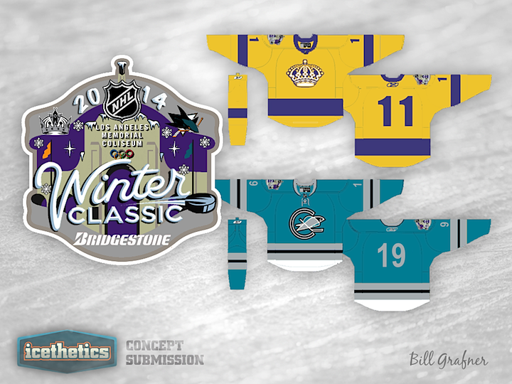
Bill Grafner wants a Winter Classic to take place in California and he's designed a logo and pinpointed jerseys he'd like to see used. Here's what he has to say about it.
This is the hopes that maybe to apologize for a lockout, maybe we can get two winter classics next year. One on the East Coast and than a night game here in L.A. Temps at night should be great for a game and if Vegas can host an outdoor game so can we. I choose the sharks because of the fact that the Seals were also an expansion six team and the great rivalry between Southern California and Northern California.
I know some will say the Ducks but I feel the expansion six is a stronger toe in for a Winter Classic. I choose the California Seal logo and put it on the original Sharks colors for the fans to relate and a throwback to the original Sharks jersey. I went with the gold for the Kings because that was the jersey they wore for the Miracle on Manchester.
I know the Winter classic is supposed to be dark jerseys at home, but the Miracle means a lot to fans here and we already had the forum blue in games versus the Canucks and as a throwback jersey so this is a better jersey for a winter classic. Also, then the Sharks can be in teal not white or cream color.
I also included a fun Winter Classic Logo. I know it may be a bit busy but that is how we do it here in L.A.
 Bill Grafner


Reader Comments (5)
I like the idea, but I think the Kings should go with the purple unis and then move the Seals/Sharks to their gold (or if you want to keep the Kings in gold, move the Sea;s/Sharks to the aqua) but I wouldn't put them on the Sharks current teal as it doesn't really fit in the retro scheme. I like the logo however. It looks like it would actually fit with what the NHL has previously done.
I personally think it should be the Ducks (but I'm a Ducks fan so take it with a grain of salt), the only thing I don't like about it is the combining of the Sharks and Golden Seals. I don't know if the Sharks have anything to do with the Golden Seals but I don't like the Golden Seals logo on a Sharks jersey. I would rather see a Sharks logo on a Golden Seals style jersey like how the Flames and Hitmen based their jerseys off of the Calgary Tigers for their outdoor game when the current franchises not having anything to do with the Tigers.
The Golden Seals were absorbed by Minnesota, and then split off again to form the Sharks, in the same metro area. They should be the heirs to the Seals tradition, and the Seals did wear teal for a while. A teal and gold Seals jersey with "Sharks" written in the font that the Seals used at the time they wore those colours would make the most sense.
Thanks for the suggestions. I like the idea of the sharks logo on a seals jersey. Will give that a try when I get a spare moment in a few weeks. Thanks for putting up the designs, really appreciate it.
Remember that Buffalo wore white at home against the Pittsburgh light blues in the Inaugural Winter Classic, so LA wearing gold at home is not too far fetched.