Tuesday
Oct022012
0227: Putting the Black in Blackhawks
 Tuesday · Oct 2 · 2012 | 9:00 AM PDT
  8 Comments

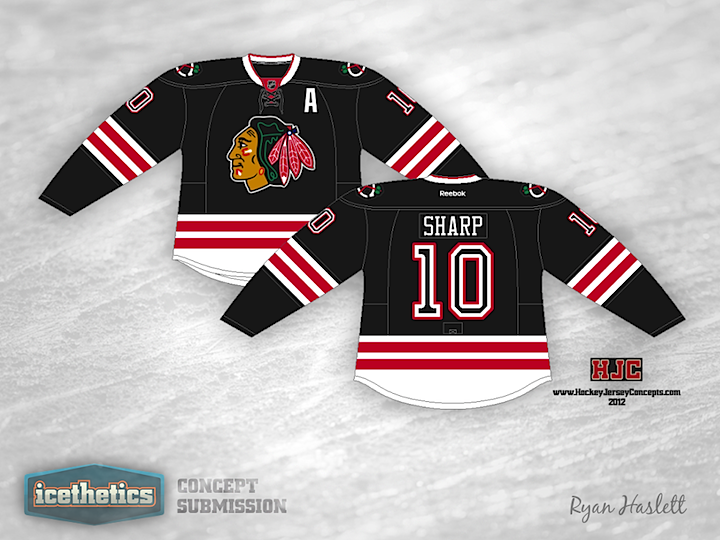
In honor of their recent NHL Tournament of Logos victory here at Icethetics, today we feature the Chicago Blackhawks. Ryan Haslett offers a revamped black jersey with some modified logos. Only thing I'm not crazy about are the numbers. What about you?
Designed by  Ryan Haslett
 Ryan Haslett


Reader Comments (8)
I'll keep saying it until someone listens. NO more black jerseys in the NHL please. The Hawks have the best jerseys in the NHL already, they don't need an alternate.
Numbers are from the 1937-39 sweaters.
Yeah but they have the word "black" in their name, so I think they can have a black sweater haha
Great design, but the re-colorization of the logo doesn't work for me.
i greatly prefer these to their classic black alt.
I would buy this, no problem. I didn't even notice the recoloring of the crest until it was mentioned, but it looks better with a simpler color scheme in this case. As for the numbers, I really like it, it has a kind of stencil look to it. It might not look as sharp in actual usage, but it looks nice on paper. 5 stars from me!
these are great but the numbering on the back sucks. make the numbers solid white and you got a winner.
'SHARP', yep that's the right word for this great concept, i'd buy it right now if i could.....