Monday
Oct012012
0226: Tampa Bay's Past and Present
 Monday · Oct 1 · 2012 | 9:00 AM PDT
  6 Comments

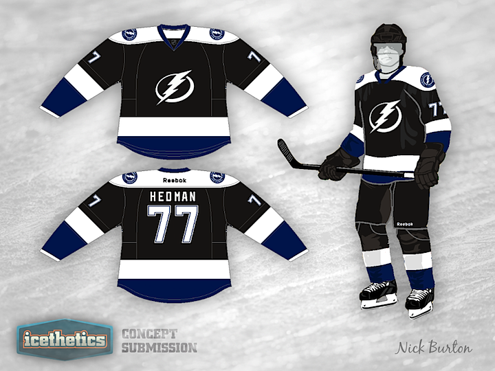
Still hoping for that black Tampa Bay Lightning jersey to return? Today, Nick Burton tries the simplest tactic — putting the current logos on the original jersey.
Designed by  Nick Burton
 Nick Burton


Reader Comments (6)
It's decent, but the blue needs to be a bit lighter. Right now, it gets lost too easily in the black.
Wonder how it would look with blue pants. And the logo looks like it's a little too low on the jersey (but it looks good on the person).
The all-white logo doesn't go with the black, blue and white uniforms.
Wow, that's a great-looking jersey!
I love that this shirt keeps the simplicity of the latest Tampa Bay look, and I love that the black is back. Tampa just isnt Tampa without the black (and grey/silver).
This concept is definitely headed in a good direction, but I think I would add a thin blue stripe above the white band on the waist and sleeve, and try to get some grey/silver in the mix, but I dont know where that would go yet..
Great concept!
It's... Beautiful. Just needs a lighter blue and a lightning bolt on the pants