Saturday
Oct272012
0252: Vancouver's Winter Classic
 Saturday · Oct 27 · 2012 | 9:00 AM PDT
  10 Comments

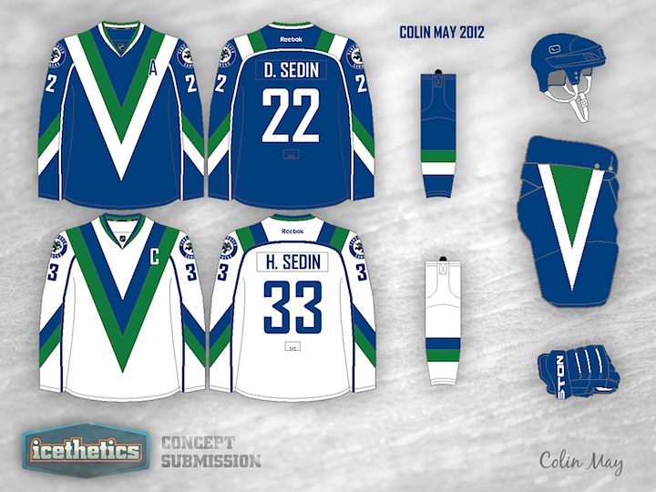
Someday the Vancouver Canucks will have to figure into the NHL Winter Classic. And when they do, Colin May has a couple of uniform designs that could work quite well. I know we all like to mock the V jerseys (especially in those colors), but I think this blue and green look is pretty sharp. But if that's not your cup of tea, what about this one below?

Designed by  Colin May
 Colin May


Reader Comments (10)
Ilike how he put schneider's name on it instead of luongo
The first one looks like a bad suit. with a missing tie.
That second jersey is what they should wear full-time. Outstanding.
I absolutely love them both but I would like to see the first set more.
as a canucks fan i'd rather have a millionaires jersey or the black '94 jersey but this is pretty good
These are terrific. I wonder if, with the second set's dark jerseys, the logo colour could be inversed, i.e. blue to white and vice versa. It might make it pop better on the dark background.
Well done.
the designs look really good, both sets look pretty sharp, especially the 2nd one. But I think they might look a bit better if they used the older color scheme. That 2nd jersey with the old black/red/yellow design would look amazing
It doesn't matter what color it is, it still looks like a plate of spaghetti. The first set, however, is actually not bad. I don't mind it.
The color scheme is horrendous. Those hues of blue and green are just DREADFUL.
First one looks very good. Only tweaks I can think of would to be to lose the circle and the Vancouver Canucks on the shoulder patches and just keep the Johnny Canuck. Could also move the Johnny Canuck down below the numbers like the 1982-85 jerseys. Another option would be to take the Johnny Canuck off the sleeves and put one on the back of the collar where Reebok currently is.