Entries in vancouver canucks (33)

Thursday
Jan302014

0713: The Big V

This logo has been pretty divisive in the past, but I can't help but like it. It really says "Canucks" in a way the orca never could. Nevill Carney presents a set of jerseys that would make for a great uniform in Vancouver's future. Who's with me?

Friday
Jan032014

0686: Freak Out '80s Style

Tampa/Vancouver Week wraps up with a Vancity freak out. Bryan Dyck is merging the Canucks' 1980s color palette with their new Johnny Canuck logo. It's pretty clever but I'm not sure I'd want to see it anywhere outside the Concepts page. (Note the yellow socks!)

See a pattern forming here? Todd Varga added the 1980s palette to the stick-in-rink logo. Again, makes for a neat jersey set, but probably not one we'd want to see on the ice anytime soon.

Newcomer Dallas Kirkpatrick is just scaring me now.

And finally, I was saving this one. Remember yesterday's Johnny Canuck set from John Elbertson? He included this yellow one as well but it fit so much better with today's theme.

Thursday
Jan022014

0685: Johnny Canuck

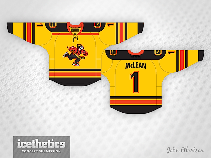
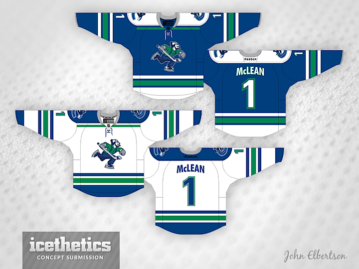
As Tampa/Vancouver Week winds down, we continue to explore the Canucks' ongoing identity crisis. On Tuesday, the stick-in-the-rink logo was featured. Today, the star is Johnny Canuck. John Elbertson created this set with a home, road and retro-inspired alternate jersey.


Now how about in green?

Ben Macdonald's contribution would actually fit in quite nicely with John's home and road set. And that Johnny Canuck logo really stands out well on green.

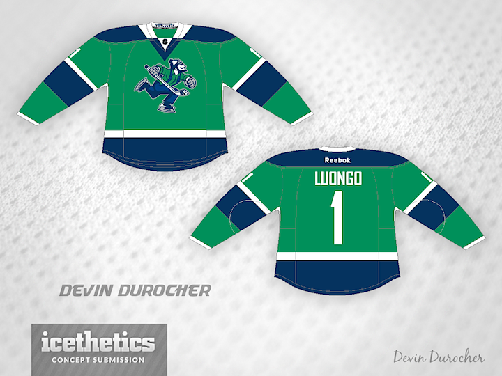
Devin Durocher also went with green but I thought his overall feel was different enough from Ben's to warrant posting them together. Do you have a preference? Would you like to see Johnny Canuck on the chest of a Vancouver player someday?

By the way, is there a reason why everyone who designed a Johnny Canuck jersey put a goalie's name and number on the back? Weird, right?
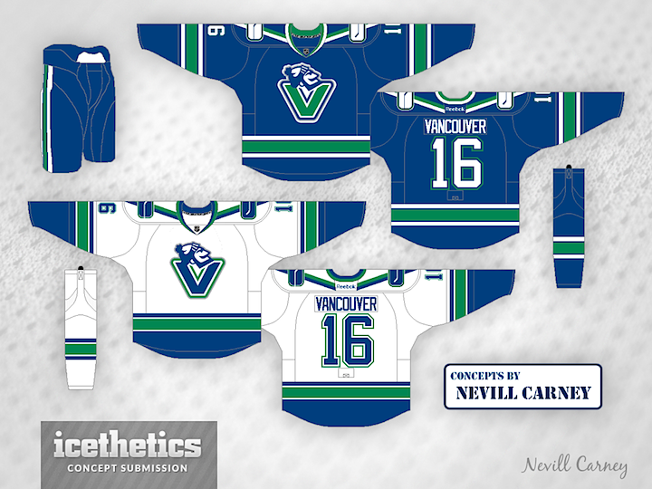
Tuesday
Dec312013

0683: The Stick in the Rink

We're riding out 2013 with the Canucks today as part of Tampa/Vancouver Week. The Lightning are in Vancouver tomorrow — one of only two games taking place in the NHL. (Any guesses what the other one is?) The theme today, as you may have guessed, is the Canuck's retro stick-in-the-rink logo. It's featured on every design today, including this one from Bastian Schmülling. I particularly like the green option.

Tex Fischer brings us a more subdued set. But I think that crest can make any sweater stand out.

Finally, Brendan Anderson envisions a minor tweak to the Canucks' existing third before making a home and road set out of it. All three designs have unique aspects and prove that this could be a great, timeless look for Vancouver.

Monday
Dec092013

0661: Future of Vancouver

As we look to more modern jersey designs with the new Stadium Series threads, check out this Vancouver Canucks set from Justin Nahhas. He was inspired by the team's original third jersey from the 90s, but it's still a very cool look.

Saturday
Nov302013

0652: Heritage Reimagined

We now know what the Canucks and Senators will wear when the hit the ice at B.C. Place in March, but how about a "what if?" Bastian Schmülling imagines the game looking something like this. Hard to say which I like better. This or reality? What's your take?

Monday
Oct282013

0619: Bring the Green

No team is better suited to green jerseys than the Vancouver Canucks. And I'll keep preaching this until they finally do it. That's the goal. For today, though, Nick Burton gets the assist with this brilliant yet understated uniform concept.