


Tuesday
Nov272012
0283: Penguins Re-Bourne
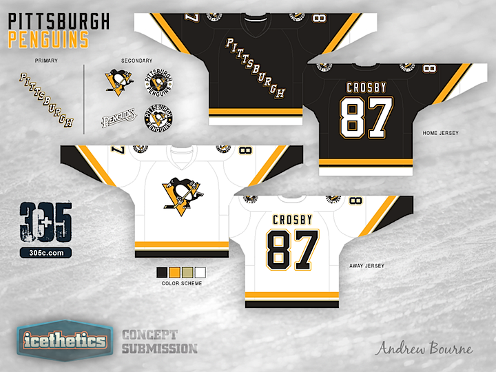
The Pittsburgh Penguins are the 17th team in Andrew Bourne's NHL makeover series. This look is a neat fusion of designs from the team's history.
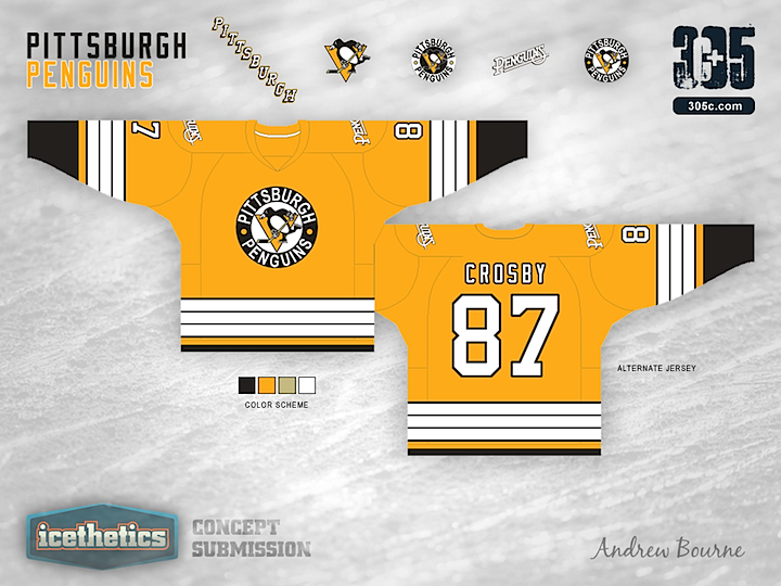
Designed by  Andrew Bourne
Andrew Bourne 
Reader Comments (9)
Not bad at all. I only rated it 3 stars, however because I just don't like the 'Pittsburgh' running down the chest on the dark jersey. Everything else though is excellent.
I'm a Pens fan and I love this to bits, it's really good. Both the white and yellow need a black collar or something to break up all the lightness, but the colors and designs overall are great.
I think this is the best concept so far in the "ReBourne" series
I don't like the black jersey. So tired of words being used on jerseys instead of logos. Plus, since teams now where darks at home, it should probably ready Penguins. The gold is a nice third and the whites are almost sopt on. Make a black jersey similar to the whites and this is a great set.
These are wonderful,
Only changes I'd make:
-Get rid of the secondary logo on the shoulder (I hate when teams do that)
-Thicken the yellow-gold bars at the waist and wrists (and the white and black bars at the waist too)
-Have the wrist lines go straight instead of an angle
-Make the collars on both the home & away yellow-gold and then go black for the collar of the alternate
I love the home and away jerseys. Would definitely like to see them.
The alternate, not so much (I hated the 2011 WC jerseys). Too much yellow.
I've felt pretty cold on almost all of these "ReBourne" jerseys, but these are DYNA-MITE!! I don't care about the other sentiment, I LOVE the black jersey with the workmark! the Yellow should be adopted NOW. The white is the only one I;m not over the top about, maybe it just simply does need just a little more color, as has been mentioned by others..
With NHL teams wearing dark sweaters at home this makes no sense to have the black with the city name and no logo on the chest This is typically a style for road sweaters
Not only do you not need the name of your city on your home uniforms, the "H" is out of alignment.