Tuesday
Dec182012
0304: Islanders Re-Bourne
 Tuesday · Dec 18 · 2012 | 9:00 AM PST
  6 Comments

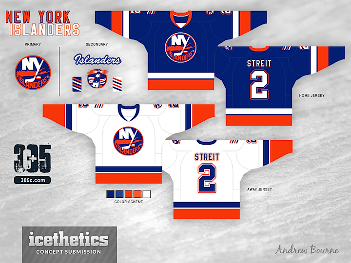
We're close to wrapping up the Re-Bourne series. The Islanders are the 19th team that Andrew Bourne has taken on since he started with the Ducks back in July. I doubt he'll do all 30 NHL clubs, but it's certainly been an interesting ride. What do you think of this set?

Designed by  Andrew Bourne
 Andrew Bourne


Reader Comments (6)
home = great!
away = great!
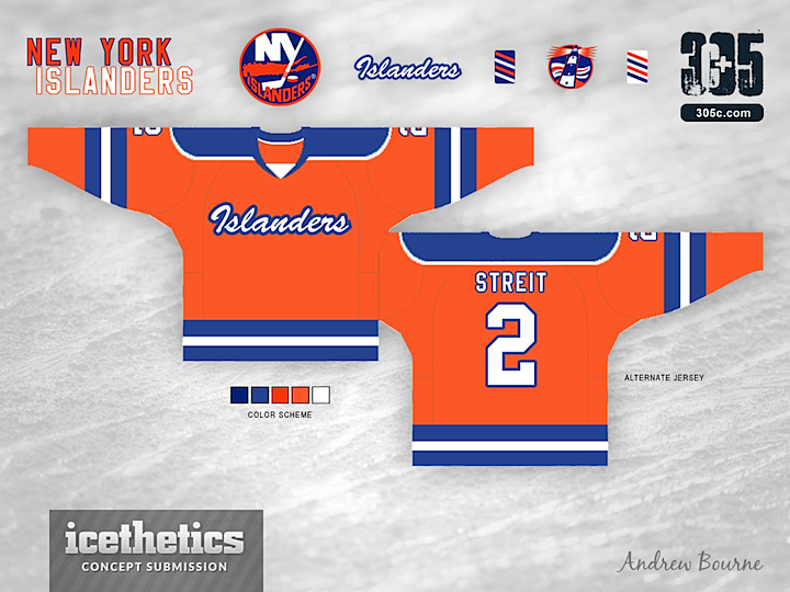
3rd= dear lord no.
I must be missing something here because to me other than couple of stripe colour swaps and stripe thickness adjustments on the sleeves the home and away jerseys are practically the same as what they wear now. The alternate jersey looks like a throwback to something the team never wore before.
Nice set but I don't see a big difference from the current jerseys either. And what's the deal with the fours stanley cup "stripes" ? Why is this on every Islander concept? I never could understand this. Do the Blackhawks have four stripes? Should the Bruins have six? The Canadiens 24 stripes? Flyers two? They were some great Islander teams but I'm not sure why it has become part of the uniform.
its basically whant they wore pre-edge era is slightly different than what they wear now
http://www.nhluniforms.com/Islanders/Islanders09.html
what they have now is based off of the jersey they wore in the 70's
http://www.nhluniforms.com/Islanders/Islanders04.html
I am an life long Islander fan and I do not understand the fascination of the 4 cup stripes, please get rid of them. They are very jr hockeyish to me.
The 3rd is just as bad as the current 3rd, where is the imagination? I like the idea of an orange jersey (see 2002 to 2007 atl. jersey) but this is not it. These look too much like the current jerseys, there is no re-branding other than the return of the lighthouse logo. I was hoping for more, much more.
It's 10 o'clock. Do you know where your concepts are?