Wednesday
Dec192012
0305: An Avalanche of Justins
 Wednesday · Dec 19 · 2012 | 11:11 PM PST
  10 Comments

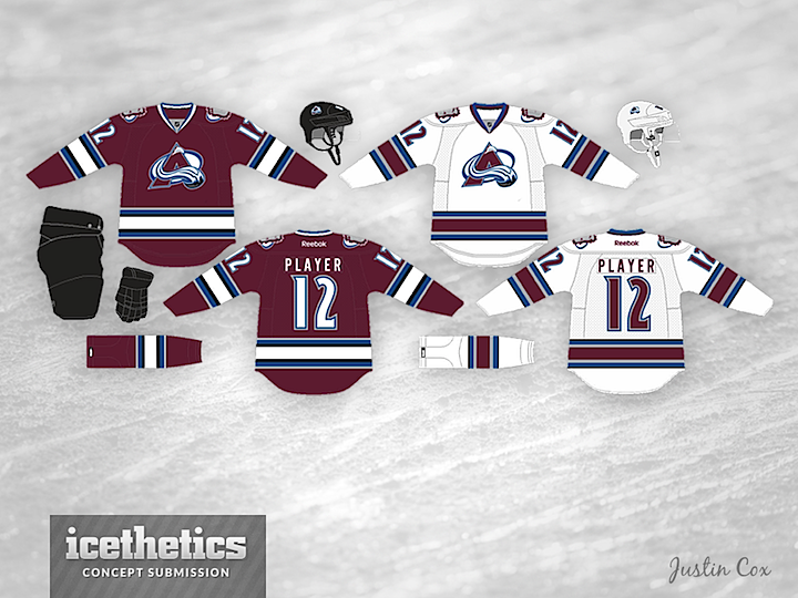
Today we get a pair of Colorado concepts from a pair of artists both named Justin. Justin Cox provides new home and road jerseys for the Avalanche — which I like a lot better than the team's existing set.

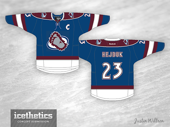
And Justin Wiltron offers an alternate jersey. Together, these three would make a really nice set.
Designed by  Justin Cox&
  Justin Wiltron
 Justin Cox&
  Justin Wiltron


Reader Comments (10)
I guess that you could say this concept came... just in time.
I like a good pun. You deserve a little credit for that one, Corey. Kudos from me.
I am a fan of these. I really like the 3rd. I really would like to see that logo on a jersey instead of COLORADO across the front. Only thing I would add to these, would be some type of shoulder yokes to the home and away.
@ Corey
( •_•)
( •_•)>⌐■-■
(⌐■_■)
I love it. Finally something that works with the good logo/color they have and feels good. The only concern (if we really need to search for one) is that it might be too similar to the Buffalo Sabres template.
classic look works because of the avs unusual color scheme
Love these. Perfect.
Not bad... but it just doesn't look like the Avs that I've grown up with. The home and away design itself isn't terrible by any means, it's way better than what they wear now, but the Avalanche are a modern team and this seems just a little too classic for them. They had some of the most unique jerseys before RBK ruined them. The mountain design was awesome, no other team had one like it. An unorthodox design for an unorthodox color scheme. But this concept doesn't really bring out the uniqueness of the team. The striping is very well done though.
The one by Wiltron isn't bad either, but doesn't grab me as something the Avs would wear, and while I like the bigfoot logo, I don't think it looks as good as a primary logo.
However, both of these concepts are some of the better ones I've seen for the Avalanche.
As an Avs fan, I LOVE these! This would be a great set. I would get that burgandy jersey in a heart beat.
This is the best concept I have ever seen on this site.
The accents on the white jerseys pop amazingly, and the layering on the numbers look incredibly.
Continuity all throughout the jersey with the striping, numbers, and collar.
Would be one of my favs NO doubt. Can we get people to show this to Colorado and start a petition? Incredible.
As an Avs fan since Day One, I would purchase these jerseys. I will not purchase, however, the jerseys they currently use. Nice work.