Saturday
Dec082012
0294: Waddell's Winter Classic, Part 5
 Saturday · Dec 8 · 2012 | 9:00 AM PST
  31 Comments

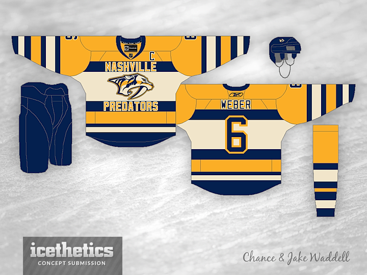
You chose; the Waddell Brothers delivered. Last week, Dylan was first to comment and asked to see the Vancouver Canucks and Nashville Predators next in our new Winter Classic series. So here they are. Chance and Jake have designed faux-back jersey concepts for all 30 teams. You've now see 10 of them.

Which two teams are next? This week, you have to be the third person to comment. (That doesn't mean comment three times under different names. I will ignore those.)


Reader Comments (31)
Carolina and Washington
Van vs Chi
Colorado and New Jersey
Lightning and Jets
New Jersey & Phoenix
Tampa and dallas
Winnipeg and Phoenix
Bruins and Sabres
San Jose and St. Louis
Chest stripes!!! lol i like it.
New Jersey and Washington
I would buy the canucks one. Nice
Surprisingly, one person commented because he didn't read the full post and everybody else waited patiently to see a second comment before posting their own suggestion. After this comment goes online, prepare to see an avalanche of comments!
Ready!
Set!
POST YOUR SUGGESTIONS!!
anaheim and los angeles
Id like to see the Dallas Stars and Montreal Canadiens
Really like the Canucks jersey here. Love the use of the V, and the striping especially on the bottom of the jersey. Id buy it.
Minnesota and St.Louis
Montreal and St. Louis
Boston VS habs
Sens VS habs
They're fun jerseys and very well executed. However, not every Classic/fauxback sweater needs a chest stripe. For example, I think the Canucks concept doesn't need that chest stripe here. If I could give a 3.9/5 I would. No chest stripe, it would be 4/5.
winnipeg and washington
Phoenix and Columbus
Can't say I like the Canucks shirt, the V and having Vancouver written inside for me anyway would have made it a candidate for FOF status.
As for the Preds, lose either the wording or the logo, and you've got a awesone shirt having both is over doing it a bit. My own opinion would be lose the logo. I'm not hot on team names on shirts, but with the stripes the way they are it works really well here.
I really like the Nashville concept; the striping and text generates a "retro" look even if the logo and colors are current. Next week, can we do Calgary and Colorado?
colorado and dallas
The Vancouver one could definitely use some fine tuning (like the word placement in the V, and maybe even removing/tweaking the chest stripe) but there are great. Absolutely love the Preds one.