Monday
Feb272012
0009: Bolts in Black
 Monday · Feb 27 · 2012 | 9:00 AM PST
  26 Comments

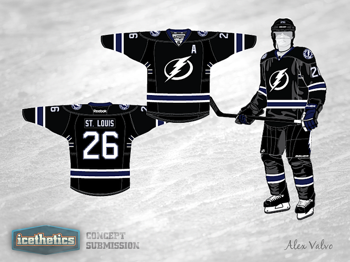
When the Tampa Bay Lightning unveiled their new uniforms last year, they did so to mixed reviews. Many lauded the simplified logo and traditional sweater design while others criticized the removal of a color that had become synonymous with the franchise. Here, Alex Valvo shows us that the Tampa Bay Lightning very well could have it all — simple logo, traditional sweater design... and black! Speaking as a fan, I'm a fan. Third jersey, anyone?
Designed by  Alex Valvo
 Alex Valvo


Reader Comments (26)
I like it, this to me says "Tampa Bay Lightning" a lot more than what they have now.
I like that a lot better than their blue Leafs-esque jersey.
BORING! Instead of the Tampa Bay 'Blue Wings' this is the TB 'Black Wings'.
I would love to see this jersey come to fruition. Would put the waist stripes a little lower. Love the victory stripes back under the armpits.
Yea, love this idea as a third! Like the Blackhawks years ago...
I really like this compared to the current third (but thats not too hard)
its a good look for Tampa in black, the only problem I see is that, it looks exactly the same as the SJS 3rd with the addition of a waist band (and maybe some stripe size differences)
Dont get me wrong I think it looks great.
These are sexy. I love the blue ones and I'm not a fan of using black in jerseys, but the all black looks sick and speaks "Tampa Bay" to me.
I think this is great. I am not a huge fan of black jerseys, but I think this one would be fine.
And although I do like the current blue jerseys better than these ones (in fact I really really really like their current jerseys), I would actually like to see Tampa Bay switch to something like this simply because it provides more of a unique identity for them. Right now when I see highlights of them I always think its the Leafs at first glance which kinda sucks.
Generally I hate black jerseys and love blue jerseys. That being said, these jerseys are awesome! Would give the lightning the best set of three jerseys that they've ever had. Plus, the lightning really are synonymous with this color, and they need it back. Definitely should be their third when the "bolts" uni is gone
I think that if a blue outline was put around the logo this would be good enough to be the primary.
mmmmm, bit too much black for me, good design but not great.....
That would be a fantastic compliment to an already-very-good set. I wonder how it would look with blue shorts? As it is, it's a five-star design worthy of instant-implimentation (as the alternate).
It looks great. I would just add some light blue accents or stripes instead of the blue that's already there.
I have to agree with TJ. I love their current uniforms and I believe this would be a great black uniform to complement the Home and Away threads.
This is by far the best lightning jersey concept I've ever seen. I hope this becomes their 3rd jersey it'd be perfect
I like this, but I think it could be refined a bit.
Awesome! Tampa needs at least some black imo. Plus, as Jeff said, I think the logo should have some kind og blue outline. Maybe some blue pants and helmets as well -- Just to break up all the black and give it a little more POP! Damn near a 5/5 design... Nice work!
No mistaking this for a Leafs uniform. It actually looks like the Tampa Bay Lightning. Very nice.
I love it! Would totally buy this!! Amazing how it's only a few tweaks away from the current sweaters, but looks totally unique!
Yup,
This is TBAY for sure.
I vote to see this concept with blue pants, helmet, and gloves. See how that looks.
Once again, people trying to copy the Kings.
I enjoy seeing a third jersey with primarily a black color scheme. However, that is just me. I wouldn't mind seeing the Lightning don this jersey as a third. Because we all know and 'love' their current third.
I would change the blue to the original 90s shade, and make the shoulder yoke white. Other than that, great work! I hope the Lightning do something like this in the future.
It needs outlines of gray to really look sleek & official. It might work to implement a thin white (maybe w/ gray trim) lightning bolt as the stripe going outward from either side of the name plate & down each arm. & make a different shoulder patch than the regular uni's, too