Entries in tampa bay lightning (20)

Thursday
Jan092014

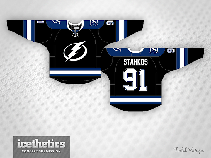
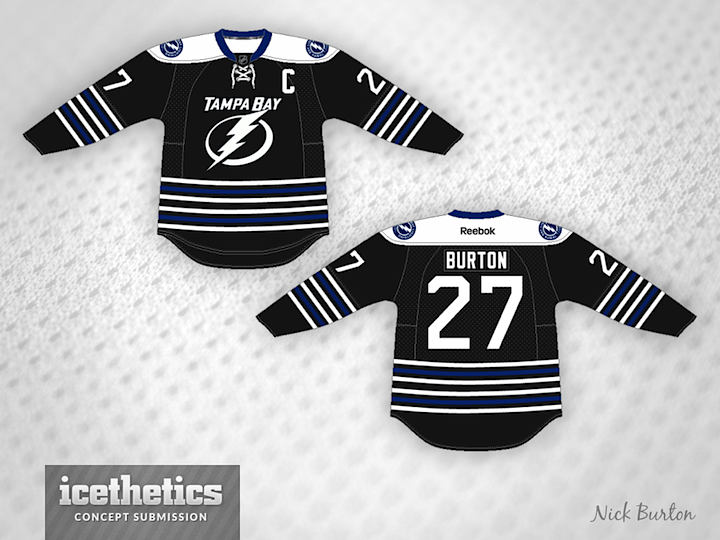
0692: Post-Edge Bolts

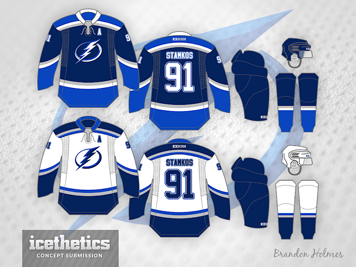
Steven Grant has been on a mission to rescue the NHL from the grips of the infamous Reebok Edge jerseys. And he's been rather successful, as evidenced by this Tampa Bay Lightning set. He thinks the Bolts should revert back to their original Edge-era logos, however. As far as I'm concerned, give me victory stripes and a white shoulder yoke on the home jersey, and we've got a winner.

Wednesday
Jan012014

0684: New Year, New Bolts

Happy New Year! Hey, believe it or not there's more than one NHL game on the schedule today. The Lightning are in Vancouver today — and so am I. And that's the reason for Tampa/Vancouver Week. Brandon Holmes gets 2014 started with a sharp two-tone blue set for the Bolts.

And as a bonus, here's a rare one. A completely original uniform and logo design from Devin Durocher. I like his simplified logo. Not sure about the third jersey. Thoughts?

We'll go back to the Canucks to finish out the week!

Monday
Dec302013

0682: Bolts Flashback

As a Lightning fan living in Seattle, I don't get to many of my team's games these days. But since the NHL's realignment and new method of scheduling, my Bolts are guaranteed to visit nearby Vancouver once a year. That happens this week — on Wednesday, in fact. So in honor of that, I'm designating this Tampa/Vancouver Week on the Concepts page!

Today, we focus on the Lightning. First up is a throwback-inspired home and third jersey set by Kevin Dion. I'm not sure the shading is necessary on the primary logo, but otherwise it's a solid pair.

I also wanted to feature this one by Jonathan Tweedle. It'd be an interesting striping pattern for the Lightning to try. But with the '90s long behind us, I'm not sure we'll ever get the chance to see it happen. But both of these submissions beg the question: Do the Lightning need a black jersey again?

Tomorrow is all about the Canucks!

Wednesday
Dec112013

0663: Tampa Bay Fauxback

Alan Moore has merged the Lightning's current look with its original one. Here's his explanation:

Here's a Lightning alternate concept. It's more of a logo concept than a jersey concept, as the jersey is almost identical to their pre-Edge look. I do like their current home and away, but I think the alternate is out of place now.

I modified their existing secondary logo to look more like their original primary mark, adding a silver background and using the shape of the original bolt but with a more modest drop shadow. Sort of a fauxback idea.

I also applied a blue drop shadow to their existing number font. It's intended to be a throwback to their first season look.

Saturday
Oct262013

0617: The Florida Classic

This one's kind of a Freak Out Winter Classic Saturday. Scott Dempsey figures if the NHL can stage an outdoor game in southern California, why not Florida?

Wednesday
Oct162013

0607: Black Bolts

This is proof the Tampa Bay Lightning need to put a black jersey back into the mix. Todd Varga has put together what could be a great alternate.

Tuesday
Sep242013

0584: By Nick Burton

Continuing our week of featuring prolific artists is Nick Burton. Last week he wrapped up his WNHL series. Today we get a glimpse at some NHL jerseys, including this very green Canucks set. Not for nothing, but I would buy that in a heartbeat.

He's got a sharp fauxback for the Kings as well. I could see a grey jersey working very well if it was executed this way.

Lastly, he's putting the Bolts back in black but with the new logos. I'm not sure it needs all the stripes, but I'm looking forward to an eventual black third jersey in Tampa.