Sunday
Mar112012
0022: A Cracked Bell in the Elements
 Sunday · Mar 11 · 2012 | 10:00 AM PDT
  5 Comments

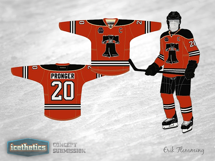
Like I said yesterday, it feels like we need a break from the Wings and Leafs this Winter Classic Weekend. So I'm digging deep into my inbox. This Philadelphia Flyers concept from Erik Flemming was emailed to me way back in November. The Liberty Bell has long been used by concept artists as a secondary emblem for the Flyers. Here, Erik explains his design choices:
Key design features:
- Liberty Bell crest inspired by print image from 1966 contest to name the team
- Three thin black stripes are borrowed from Philadelphia Quakers sweater
- Two vintage white stripes represent the Philadelphia Flyers two Stanley Cup championships
- Fonts are current uniform fonts which have remained largely unchanged since 1967-68 (numbers) and 1972-73 (names)
- Shoulder design to be added (either current winged P logo or 45th anniversary logo)
Designed by  Erik Flemming
 Erik Flemming


Reader Comments (5)
Weird I thought today was Sunday not Friday. What a terrible jersey.
I don't know why this has such a low rating. I like it and I think it's better than what they actually wore for the classic. I guess the logo is a bit large, but other than that I can't find a real fault with it.
I don't think that the current star rating (2 stars) is a reflection on the quality of the jersey (which is very sharp) as much as not putting the winged-P as the crest. It's a solid jersey, and I think if it had the winged-P as the crest and the bell on the shoulders, you'd have a 4-star jersey.
I don't think this is that bad. I like the idea. It's unique.
main logo looks WAY too big for the jersey......a unique design, but i dont think philly would ever consider it.