Thursday
Apr122012
0054: Phantastic Phantoms
 Thursday · Apr 12 · 2012 | 9:01 AM PDT
  7 Comments

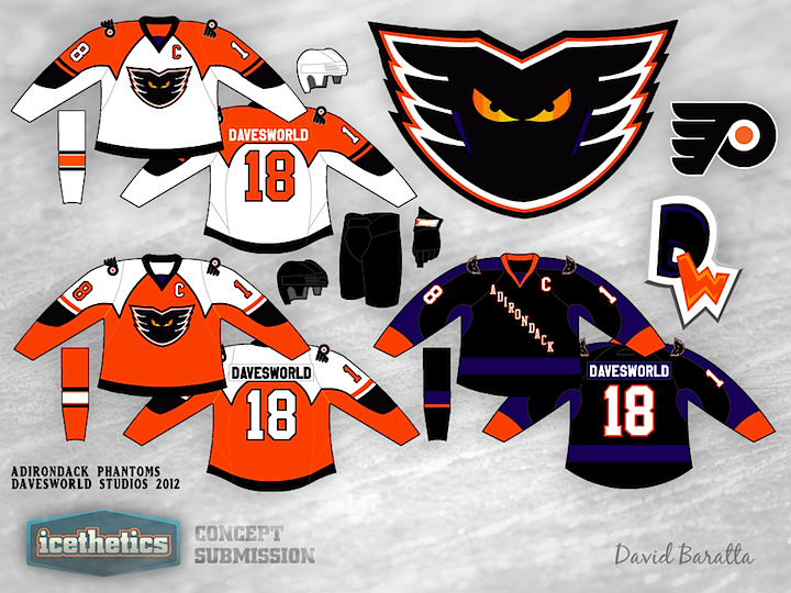
David Baratta sent in this Adirondack Phantoms concept last week while I had the minor league theme going. He suggested it for a Freak Out Friday, but I'm not so sure that's where it belongs. It's actually a very interesting set. I particularly like the look of the purple and black third jersey.
Hmm... now, tomorrow's Friday the 13th. Wonder what I might have in store for you...
Update on Saturday · Apr 14 · 2012 | 9:52 PM PDT by
 Chris
Chris
 Chris
Chris

After ruminating on some reader feedback, David has taken another stab.
Designed by  David Baratta
 David Baratta


Reader Comments (7)
love the concept; however, i think it would look better if you switched around the purple and black, but thats just me
I really like the purple/black third
I think there is too much going on with the home/road set though. I'd say just replace the purple on those with black or make the main body of the road and the accent of the home jersey purple
In my opinion the purple doesn't really work in this design, but rather just looks forced than anything else.
What a weird amalgamation of the Flyers' 2nd-generation design with the Ottawa/Pittsburgh-shared Edge template. I kinda like it!
The purple one is interesting in itself, but I think the Phantoms logo should replace one of the Flyers' shoulder logos on that one.
Fantastic work. Not 100% sure about the contrasting color nameplates that actually aren't on the home and road jerseys, though. I'd be interested in seeing what the jerseys would look like if the contrast plates on both were white lettering on purple or black nameplates.
Nah. The original is much better. Then again, I am an Olympiques fan, so I do have a bit of an affection for the Orange/Purple/Black colour scheme.
I agree with taoiseach. The purple really makes it stand out and stand apart from the parent club. And from a business end, you want the club to have its own identity for a number of reasons, like merchandising. Also, I feel like fans respond better when they are rallying behind THEIR team, not just a "major league knock-off." Anyways, I really like the original. It's modern and different, which everyone seems to be getting away from. Good work!