


0053: Duck... Duck... Green!
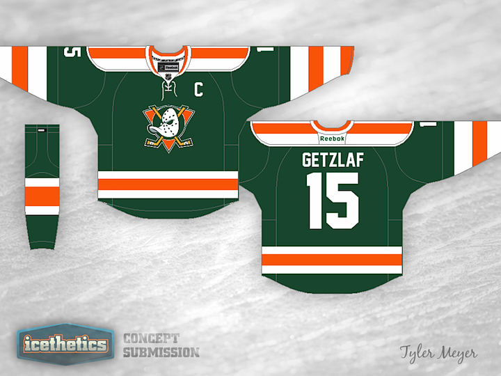
In concept designing efforts, we often talk about the difficulty of finding a unique color scheme for a given team. I think Tyler Meyer has found the perfect one for the Ducks in green and orange. It has three things going for it in the color department alone: it's brighter, has no black, and lots of green! I even like the giant stripes on this jersey. Between this and the Kings concept I posted on Monday, the Pacific Division could look pretty amazing if Icethetics concept artists had their way.
 Chris
Chris
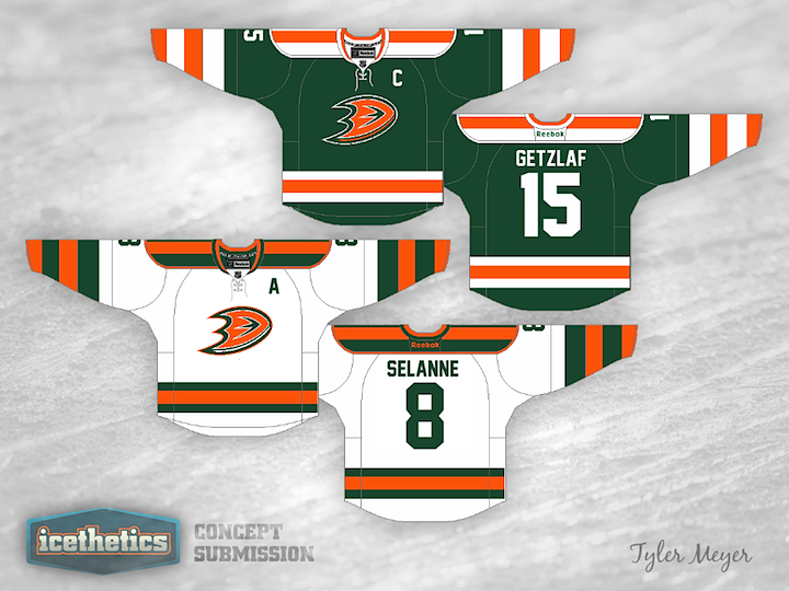
As you may have read the comments, Tyler was pretty thrilled to see some of the feedback on his concept. So he took some of your ideas into consideration and provided this home and road set for your enjoyment. Personally, I think the old duck mask logo works better with this look and color palette, but really it's fantastic either way.
Tyler Meyer 
Reader Comments (13)
I think the Ducks should go back to purple and teal. It was just so bright and different.
Granted I'm a Kings fan but I actually like this sweater. At first glance I wasn't a fan but there are too many black and white jerseys in the league right now. It would be nice to see a few teams switch it up.
I'm not necessarily a fan of the "Mighty Ducks" logo though. I think that could be a little less Disney-ish. Alter that and I think you have a winner for that team down the I-5.
I've always seen the Ducks in Green and Orange. I think this color would suit them very well. The Uniform template here is awesome. Unfortunately, although I like the old Mighty Ducks logo, it doesn't fit here. Update the "D" colors to fit this and I think it would be better.
This is a very well done jersey. Not only does it combine colors from past/present Anaheim palettes (assuming that green is the 'jade' of the past), but together they actually look like tones a good designer would use for a team called the Ducks. And put together on a very good looking jersey design. I'd love to see a Freeway Faceoff with the Kings in their Legends jerseys and the Ducks wearing this.
However, and I know I'm not gonna be the only one who says this, so I'll just add mine to the others: this was a terrible terrible logo. Even the web-foot 'D' is better.
Really cool! The Ducks really need a proper logo again. Btw I just wanted to say that this website is fantastic. Keep up the great work!
I like the green but I'm not too wild about the orange. I would prefer if were a darker shade of orange but other than that it looks great!
I like it...it's definitely a unique look for a team that, for the only time in its history, does not have a unique look. If the Ducks don't want it, replace the crest with a fancy "IRELAND" text or logo and you'd have a perfect Team Ireland jersey.
THAT is an identity. Bold colours, its unique, if the ducks were smart enough to have this design, they would stand out. I love it. For some reason I think a recoloured duck foot D logo might look good on the shoulders, that's just my opinion...
Tyler, lets see the road uni!!
Thanks for all the feedback you guys, it's much appreciated. I'm definitely going to try to send in the away version of this when I get the time. I might also replace the Mighty Ducks logo with the webbed D sometime. I only used that one because I liked it better. It's just a preference.
Thanks again for the feedback!
use the mighty ducks logo, but make the circle (puck) inside the triangle black just to give it contrast and depth and that jersey is good to go!
Five stars on the color scheme alone, and the updated version is even better. Well done.
This is definitely the way the Ducks need to go. I think the old logo works better than the webbed D, it just needs to be bigger. Also, I'm not sure the horizontal stripes are working on the shoulders. I would love to see it with vertical stripes on the shoulders like the Chicoutimi Saguenéens. Overall a great effort and a way better look than what the Ducks currently wear.
These are GREAT!!! the Jersey template is unique, the colours are unique and not ugly as you would think. Great Job.