Wednesday
Apr252012
0067: Third Jersey for the Jets?
 Wednesday · Apr 25 · 2012 | 9:00 AM PDT
  9 Comments

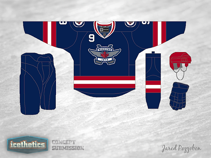
A third jersey for the Winnipeg Jets, anyone? Jared Pozzobon swapped the primary and secondary logos on this one and made red a much more prominent uniform color. But it feels like it's missing something.
Update on Wednesday · Apr 25 · 2012 | 11:59 PM PDT by
 Chris
Chris
 Chris
Chris

Jared read through some of the reader comments and made some revisions accordingly.
Designed by  Jared Pozzobon
 Jared Pozzobon


Reader Comments (9)
IMO the number should be gone from the front of the jersey and change the helmet to blue. Maybe it's just me but I like when the helmet, gloves and pants are the same colour.
I don't like the Idea of putting the shoulder patch and the number on the front. The Red helmet doesn't really fit in to well ether.
The Jets shoulder patch logo is extremely nice, but it just doesn't work as the primary logo on a jersey. Also, swap the red and white on the collar, it's better to keep consistency in the jersey. As for the number on the front, somebody like it some people don't. Just put a red outline on all the numbers, it would look a lot better. Just my opinion though.
I agree with the post above, get rid of the number on the front. I can't even begin to explain how much I hate numbers on the front of the jerseys. I also agree that the helmet should be blue. Other than that I really like this.
Thats a nice logo and awesome colors, I just don't like numbers on the fronts of jerseys
That wordmark reminds me too much of the ill-fated Toronto Bay Devil Jays.
I REALLY like the updated one. Very good work.
i chose the new wordmark because the old jets also had a wordmark on the front of their jerseys.
I like the idea, but the cursive jets on their helmets right now would be a cool logo