Monday
May142012
0086: Darkness Over Calgary
 Monday · May 14 · 2012 | 9:00 AM PDT
  15 Comments

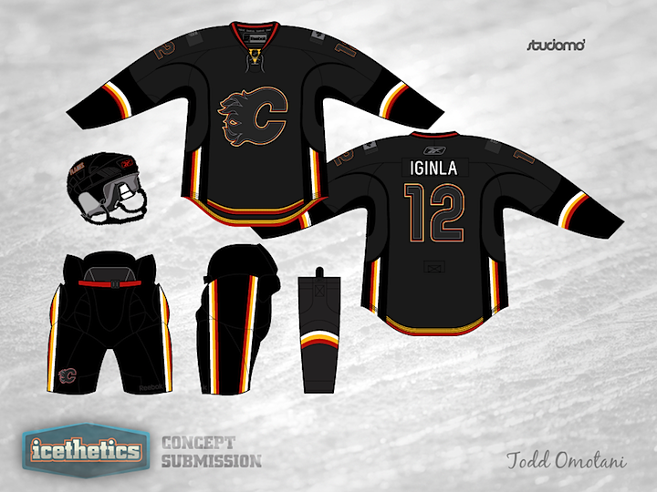
Hey, look! It's a Monday without an L.A. Kings concept. Weird. Seriously though, I wanted to go with a team we haven't had a concept for yet. And this one by Todd Omotani for the Calgary Flames is pretty cool, even if it wouldn't necessarily work in a game situation. Way too dark. It looks great. All the black and grey really make the red and yellow stand out. Looks a lot more fiery.
Update on Thursday · Jan 17 · 2013 | 1:44 AM PST by
 Chris
Chris
 Chris
Chris

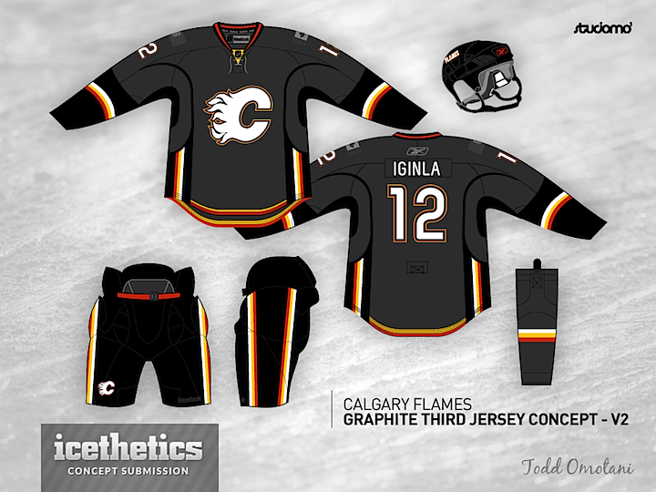
It's been eight months since this was posted, but Todd felt like creating a revised version based on reader feedback. Enjoy!
Designed by  Todd Omotani
 Todd Omotani


Reader Comments (15)
This could be a really good alternate with the white flaming C.
Swap the black logo and numbers to red and I think it could work!
I really enjoy this concept, i would like to see maybe a little more color, such as red pin stripes (ala St. Louis Blues yellow pin striping). Just a thought 5*'s
Sorry, not a fan. This reminds me a lot of those awful Black Ice jerseys which should all be burned immediately.
Awful! WAY too dark, think about how they'd look on TV.
needs more red
I personally think this is a beaut! 6/5. Way to go.
not sure i like it for the flames. In my mind the flames (fire) should be bright colors instead of dark...I do think it would make a pretty awesome Team Germany jersey though.
Nice try in terms of colours but the jersey template is so terrible that this makes it even worse. I do like what the artists is going for just a little too dark and with a terrible template but the flames have been notorious for that.
I'm with Trick Rider, I think a white flaming C and white numbers on that jersey could look real sharp.
A lot of Flames fans won't like it. Living in Calgary (but a Ducks fan) I know that some people already hate the amount of black in the current jerseys so this wouldn't go over well.
The jersey design this is based on is bad enough, compounding it with a "Black Ice" aesthetic just makes it worse.
Might be fine for some folks out on the street, but give me red and gold for the Flames, and leave the black-for-black's-sake back in the 1990s!
What I do like about this is the grey chosen, gives it a feel of smoldering coals. That said, they're not the Calgary Coal. It would be interesting to see what nonsense Reebok would do to this with their "new technology" a la All Star Jerseys. May luminescent red and gold... I'm all for wacky ideas as long as they work. I think the v2.0 of this would be pretty slick, whatever it ends up as, but it's not quite there yet.
These are beautiful!
With this update, I honestly think this concept goes from something that "wouldn't necessarily work in a game situation" - to something the Flames should really consider new that they're looking at a new third. This jersey offers a new, refreshing look to the Calgary Flames by using a gray that hasn't been used in previous jersey sets. Plus, and I'm sure I'm not the only person thinking this, it's finally an alternate that goes in a differrent direction than black. If I were Todd, I'd put some serious though about sending this up north... because it's refreshing, it's different, and it WORKS.