0691: The Flames by Hand
My favorite old school concept artist takes a stab at the Calgary Flames today. Morgo Uxbridge drew up this simplified uniform set. The third jersey was an interesting choice. Think it could work?
|
My favorite old school concept artist takes a stab at the Calgary Flames today. Morgo Uxbridge drew up this simplified uniform set. The third jersey was an interesting choice. Think it could work?
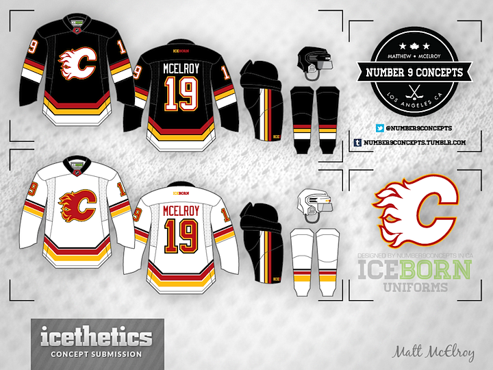
Today, Matt McElroy gives the Calgary Flames the IceBorn treatment — IceBorn being the jersey template he designed, which you can find by clicking on the Templates button in the sidebar. It's got a bit of a Team Germany feel, but it's not a bad look.
It's Sunday and that brings another Islanders concept. How about this one from Brendan Nashman inspired by the old New York Americans? And since today is unveiling day for the Calgary Flames' third jersey...
...I had to sneak this one in from Brian Brideau. He took the leaked shoulder patch and created an entire uniform design around it. I think it's actually really cool. What about you? Better or worse than the actual jersey they're unveiling today?
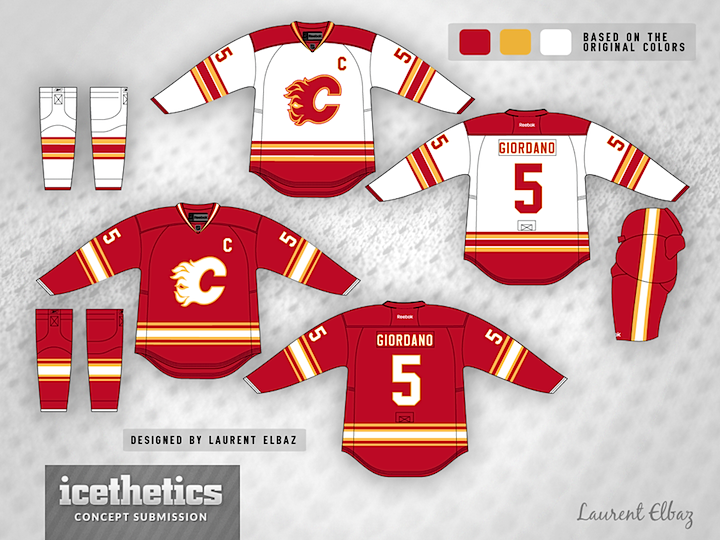
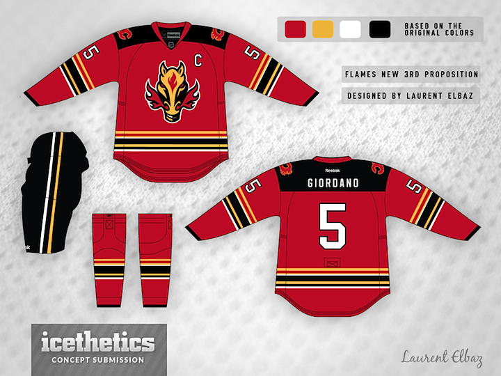
Laurent Elbaz may be a bit clairvoyant. He writes, "These designs were created before season started. To my surprise, I found out through your site that the leak is very similar to my design. Although I still prefer my 3rd jersey that the one leaked."
What do you think? Has he fixed the Flames once and for all?
Thought I'd add a separate rating box for the third jersey to see how it compares with the retro set.
How about another theme week? Got a lot of neat concepts recently that are heavy on red. So this is Red Week! We kick things off with a scarlet take on the Calgary Flames by Jeremy Klassen, who's keeping the yellow to a minimum. Of note is the white flaming C. What do you think? Especially compared to the Flames' recently leaked third jersey?
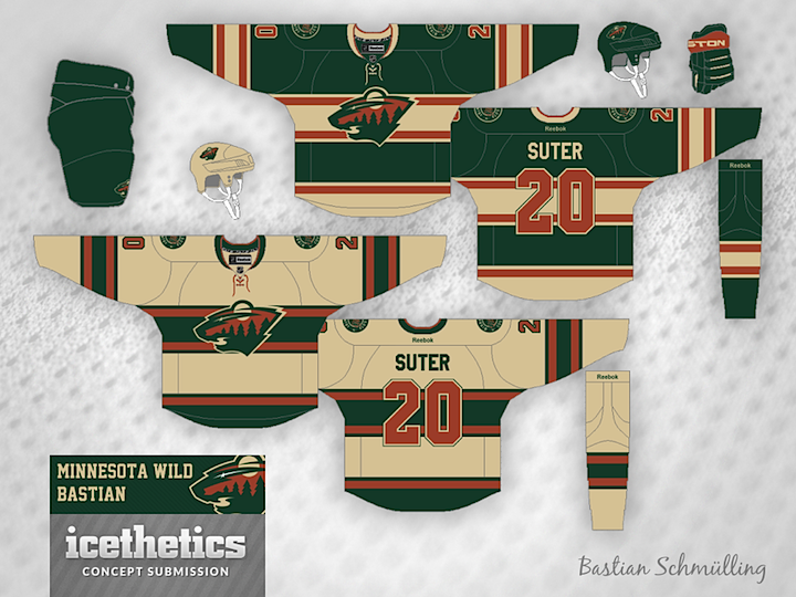
I'm launching a brand new theme week today! We have so many artists who are so prolific that I thought they deserved their own week right before hockey season starts. So each day we'll feature a trio of concepts from a specific designer, starting here with Bastian Schmülling. His Wild jerseys may look a little dingy, but they also look like instant classics.
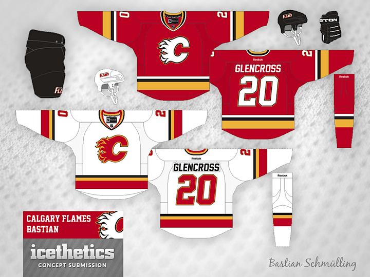
The Flames could use a uniform simplification and Bastian has the perfect answer and the best use of black I've ever seen on a Flames concept.
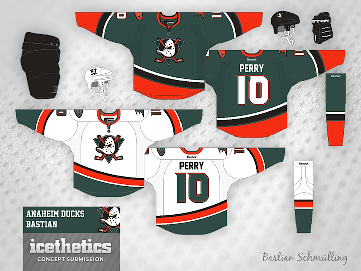
Finally, the Ducks need a way to distinguish their palette from the Flyers and that gold just isn't cutting it. So how about green? Not the first time we've seen green and orange combined in an Anaheim concept, but certainly among the better examples.
Bastian still has a ton of work that's gone unpublished to date, but I'm working to rectify that. He's got a great eye for uniform design and I, for one, am always excited to see what new ideas he's come up with.
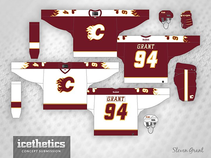
Steven Grant recently sent in this design for the Calgary Flames. It features new shades of red and gold and an homage to the old Calgary Cowboys on the shoulders. And what do you think of the flames on the sleeves?